With over 1,000,000 designs created and used in over 100 countries by businesses and organizations of all sizes, Visme is considered one of the leading Infographic design tools and a great alternative to PowerPoint.
To help it’s growing marketing and awareness needs, Visme had a marketing challenge; how do you explain what Visme is and what it does, when it’s used across a wide audience with multiple applications?
Because Visme offers so much in the way of functionality, we knew that simply telling users what it can do would ultimately inadequate.
Besides, we also wanted to do something a little more unique where it seems more and more explainer videos have the same tone and feel.
Visme wanted something different.
It wanted to tell a story, yet at the same time focus on the two most important elements of all – what it can do and how it can empower it’s users.
With these goals in mind, we set out to create an explainer video for Visme that helped shed light on what it is, what it can do and why that matters in the most emotional and compelling ways possible.
The Early Stages
It all started with an in-depth brainstorming phase. It started from simple notes on an iPhone notepad to establish the direction of the story.
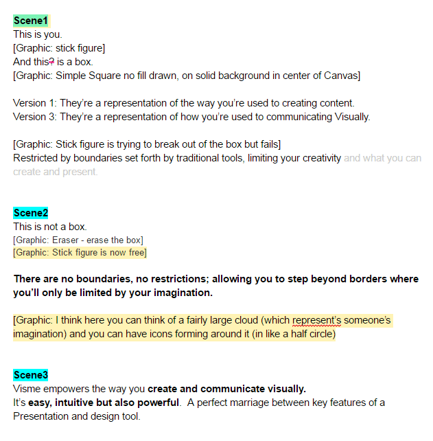
And eventually we formed a full script that the scenes and all the animations would be created on.
When creating an explainer video, we had two distinct challenges:
First, we wanted to inject as much emotion into Visme as possible without using an actual human or a cheesy cartoon character.

Secondly, we wanted to speak to our users directly on how Visme can help them communicate visually.
Telling you what Visme can do is one thing – however, showing you what it can do from the perspective of an emotional, personal response is something else entirely.
To answer the first part of that challenge, early concepts were created that positioned our main character in different environments and textures to help provide contrast and separation.
By getting rid of any extra elements that could be a distraction, we embraced the idea of “less is more” – we ended up with a simple-yet-direct idea for a background to position our character in.
This was all about the story and to effectively tell it we needed the minimum number of elements (including color) to translate the message to the viewer.
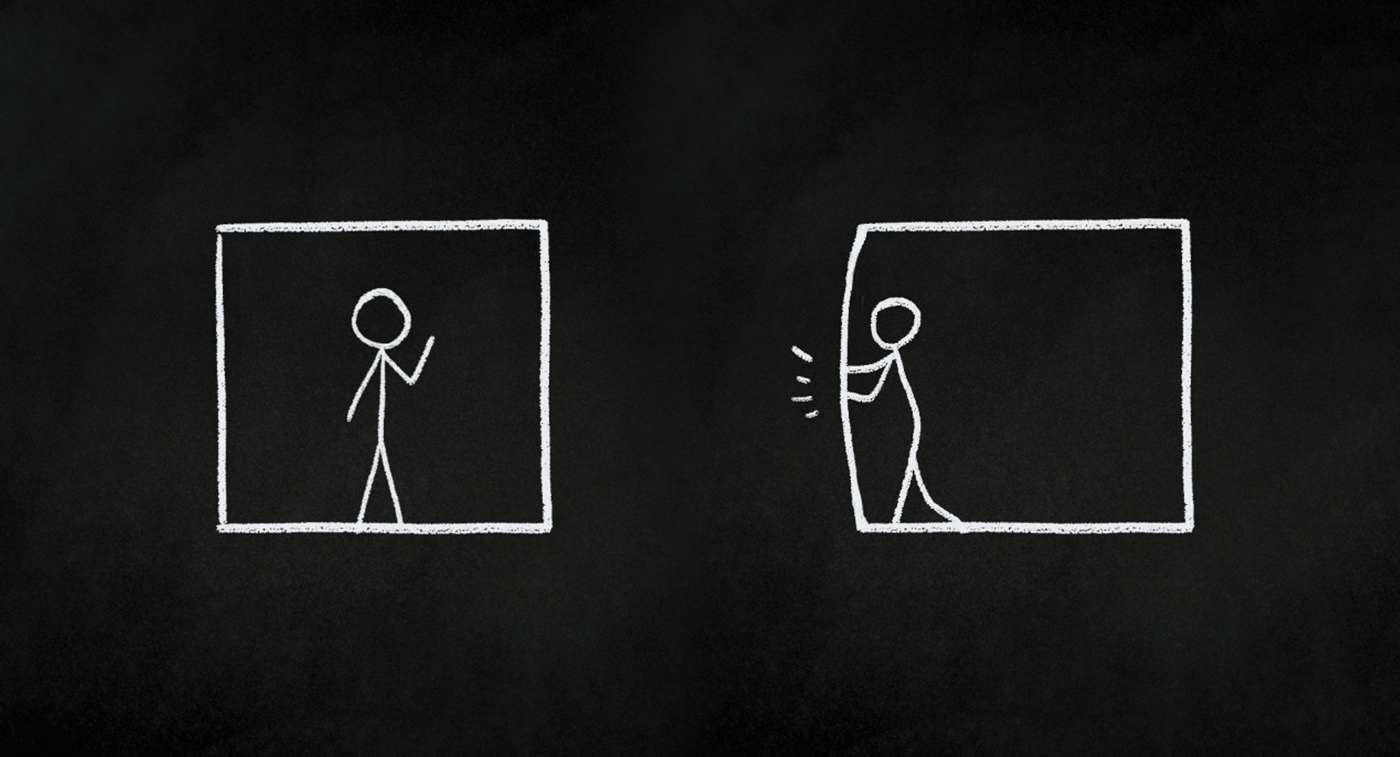
Even though there are really just the two main elements during this first part of the video (the character himself and the box he interacts with), this was still one of the most challenging parts.
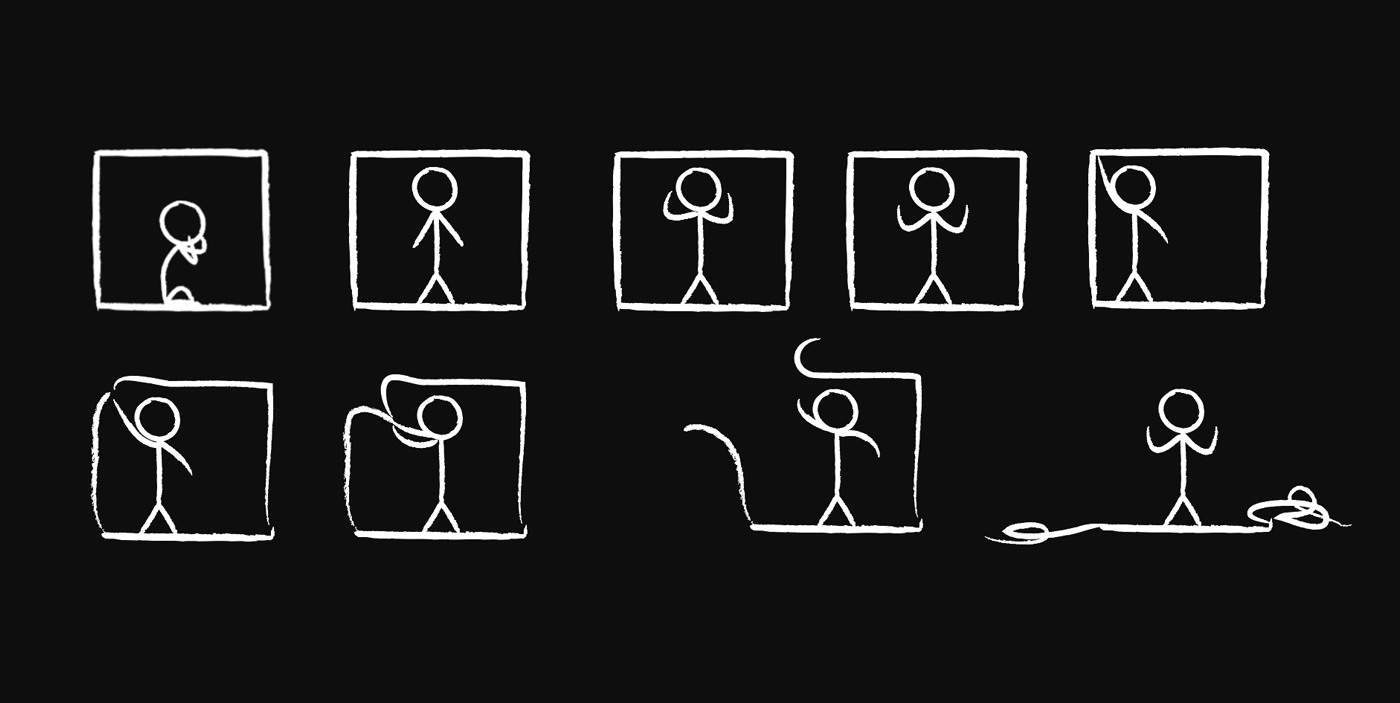
The main character is a stick figure – not necessarily something that you can project a lot of emotions on. Yet at the same time, from within that simplicity we wanted to create something organic, real, and, well… human.
It may only take five strokes to draw a stick figure, bringing him to life and animating his posture and movements to act like a real human was no simple task requiring days of painstaking work to perfect.
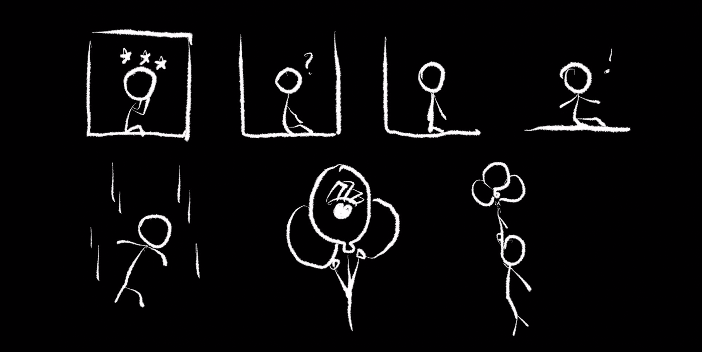
We wanted to contrast this with the boring, restricted world of the box.
When the stick figure character is freed from the box, the world changes – it all becomes much more beautiful and more colorful. This was a key transition in the video where we needed to achieve a change in environment and the mood to portray creative freedom and ease of use.
To transition from this dark space and into the next stage of the video, we needed an element to connect both worlds.
We landed on the concept of balloons that would swoop in and save the character from falling. These represent Visme and the very features that helped us with this transition in the first place.
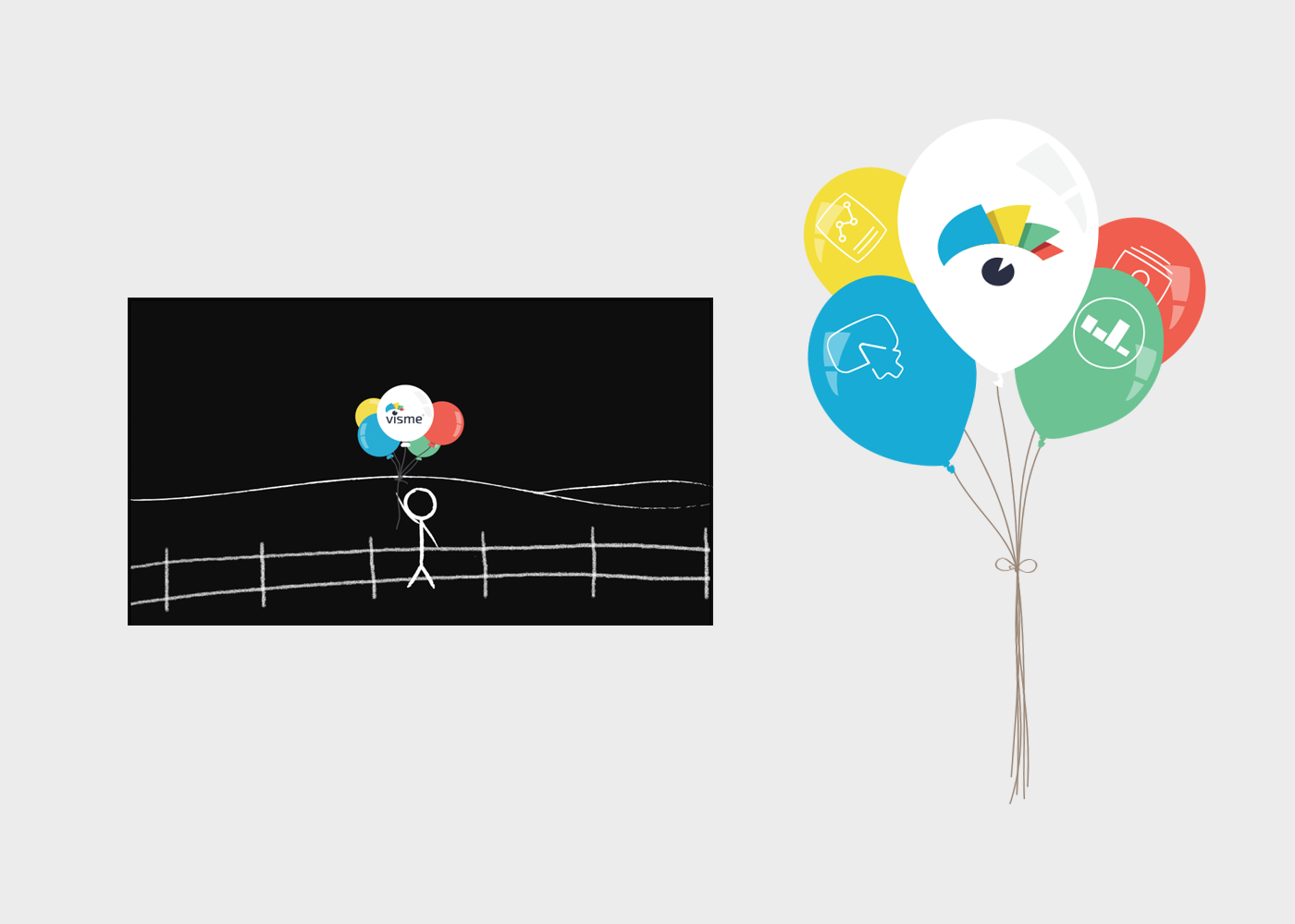
Visme Features: Breaking It Down
Once we finished all the character animations for the video, we moved onto the next portion – functionality.
At HindSite Interactive know that Visme can create engaging presentations and Infographics along with reports, interactive demos, graphics, visual resumes and more. Translating all of this information from words to visual concepts needed to be lightning fast and startlingly effective.
To help pull this off, each Visme feature is represented with a specific color. This allows them to not only come together and start appearing on their own individual stage to give each one a sense of relevance, but to also create an over-arching sense of unity as they all start to appear together.
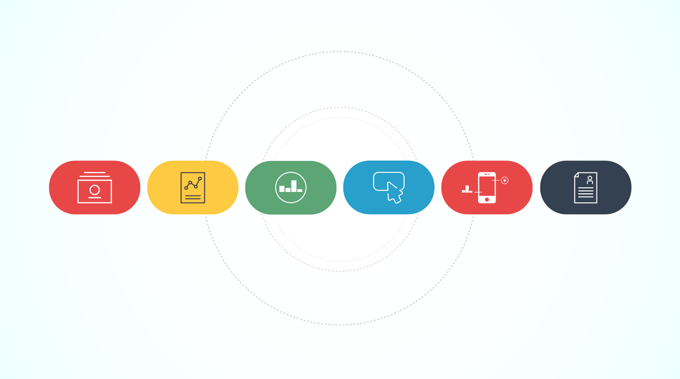
This concept evolved over time and eventually became the transition between scenes. The continuity and general sense of flow of each scene was also very important, because we wanted to keep it very dramatic and engaging throughout.

We wanted the video to be building towards something, which required a kind of emotional driver. Keep in mind, within the span of just a few seconds we’re presenting the versatility of Visme AND all of the different types of content the user will be able to create with just a single tool. The longer this takes to explain, the more complex Visme seems when we all know the opposite is true.
Customization Is King
After we settled on the introduction of the main features, we wanted to dive a bit deeper into how the customization of your content actually works. We wanted this section to be heavily illustrative, presenting real elements from the program and showing you exactly how you might interact with them in order to customize content.
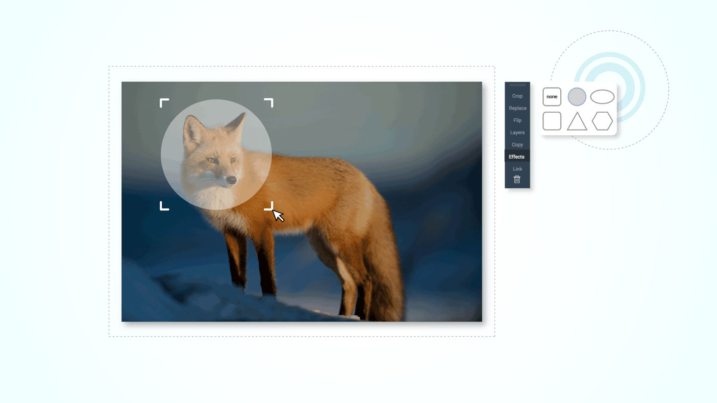
We wanted to show how the ACTUAL interface is ACTUALLY used – from font and icon customization to gallery pictures and how to crop and edit them. With just a few quick mouse clicks, we wanted to show (not tell) the users where they can find all these different options in the Visme toolbar.
Following this lesson on the customization of content, we also wanted to show you Visme allows you to transform boring data into engaging visuals. We did this with the help of the widgets, graphs, interactive maps and animations built right into the software.

We believe the process you go through to transform your data should be easy and NOT overwhelming – so we wanted to find a way to translate this feeling into the video itself by making it fluid, with crystal clear transitions and squeaky clean graphic elements.
Making it interactive
Given the nature of the video and that Visme includes a full animation engine, we needed to up the ante on the animation and interactivity of the video.
Assets and Library

The Finishing Touches
The only thing more important than the beginning of your story is the end of it – such was the case with our video. Finding an ending with real impact was our top priority, so we immediately tried a range of different concepts. In the end, we believe we found a great way to connect where the story started (inside that box) and show how the character (standing in for our users) finally sets free and unleashes the power of its own creativity.
There truly is no more perfect metaphor for this than an explosion, which is why our video literally ends with a “bang.” It’s a great way to underline all of the content that you can finally create with the help of Visme and your imagination. The possibilities are truly endless.

Like in any creative process, some ideas were left out. Others remained, but not before being significantly improved. Having so many concepts to visualize in a very short amount of time, all while keeping consistency in style of graphics and creating clean transitions between scenes, was far and away the big challenge while making the video.
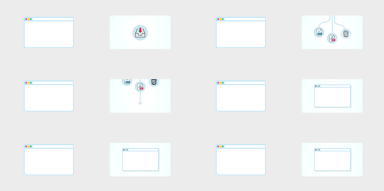
After completing all the scenes, adding audio effects and narration and making some final adjustments in timing and animation, we were ultimately able to turn one beautifully simple idea into a pretty kickass explainer video: Visme is indeed the one simple tool to create amazing content you need when you need it the most.

Here’s the finished product:
View Full Version on Youtube

What makes an explainer video a creative video is its script if the script is story based and the story is good then the explainer video will be surely great.
These tips provided in this article are really useful for creating a script in explainer video production process.