You may think your website is “good enough” to get the job done, but does it really make the grade?
Simple website design mistakes may actually be driving away visitors to the competition, costing you thousands of dollars in potential leads — and, worst of all, you may not even be aware of it.
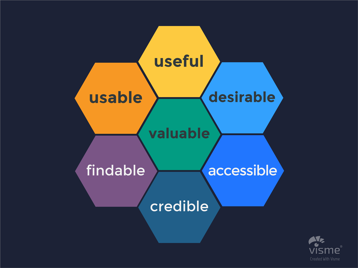
To help you find out whether your website is fulfilling its purpose as your number one marketing and business tool, we’ve compiled a list of key characteristics every good website should have, according to the user experience honeycomb.
Keep reading below to learn more about what exactly makes a good website, or if you’d like to skip ahead and get your own personal website report card now, you can click on the button below to complete our website grader in a few minutes.
1. Desirable

As the saying goes, you never get a second chance to make a first impression — so you want to make it a good one.
While a bad website may cause visitors to click away faster than you can say “welcome,” a good website uses design elements to establish a memorable visual identity, communicate a clear message, evoke emotion and, ultimately, leave a lasting impression.
As an example, take a look at how Impero’s website above sends a bold, strong message in line with the brand’s values and personality.
To evaluate your own website, ask yourself a few questions:
- Does your website’s design attract users’ eyes?
- Is your color scheme and selection of graphics consistent with your brand?
- Are fonts easy to read on all screens?
2. Useful
Have you ever visited a site that caught your eye at first sight but didn’t help you in any tangible way? Like in real life, looks without substance will only take you so far online.
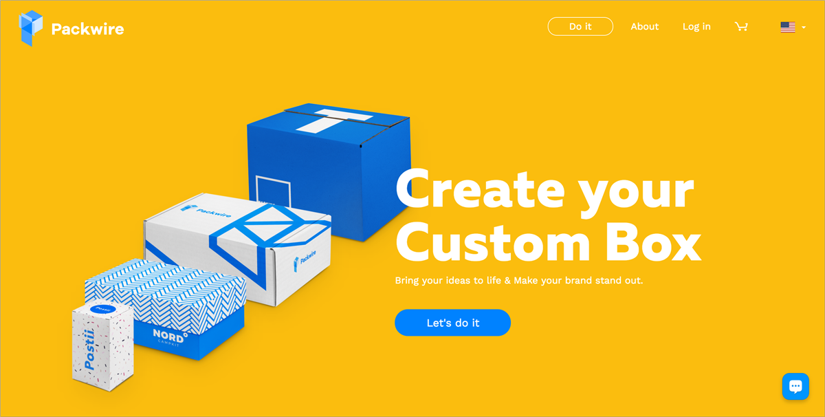
Make your site worth visitors’ time by providing content that meets specific needs in a clear and easy-to-understand manner. As an example, look at how Packwire’s messaging above is clear and concise and directly address potential customers’ needs and pain points.
Show signs of life through regularly updated, fresh content — let visitors see that there are real living, breathing people behind your site.
One thing’s for sure: If your last post was published a couple of years ago, then you definitely need to revisit your site’s content. But if you have to go through a web developer or designer every time you need to add or edit content, then you’re probably not updating your site as often as it needs to be.
One way around this is using a content management system that allows users to easily add and edit content without any programming or design knowledge.
Besides providing useful information and a pleasant user experience, a website can also be an extremely useful business tool.
Some of the business purposes a site can fulfill include: generating leads; providing quotes for potential customers; allowing visitors to register or schedule an appointment online; completing online transactions; or providing customer support.
To evaluate your site, ask yourself:
- Can you easily add and edit website pages without technical knowledge?
- Is your site’s content up-to-date?
- Does your website allow visitors to contact company representatives, whether through an opt-in form, a ticket system or other customer support tool?
- Does your website allows visitors to schedule appointments?
- Does your website allows visitors to complete online transactions?
3. Usable
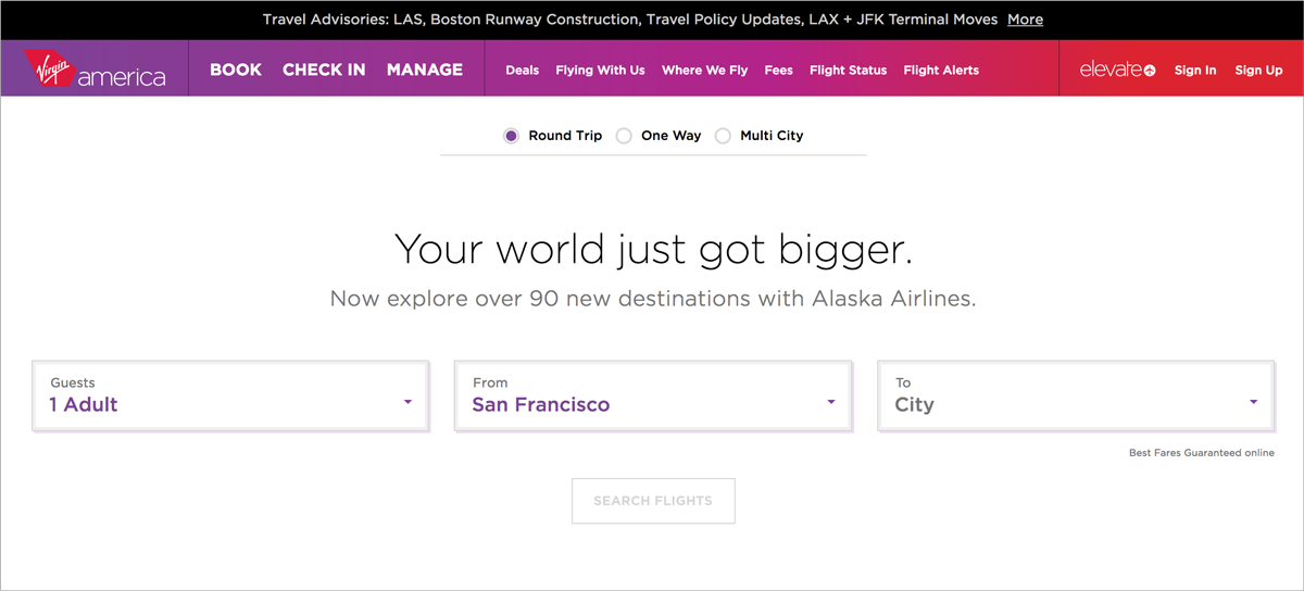
Besides being useful, your site should also be easy to use. Few things are more satisfying than a site that allows you to accomplish your goal in just a few clicks. Take a look, for example, at Virgin America‘s easy-to-use site above.
Usability essentially refers to user-centered design and it entails a variety of requirements:
- Clarity: Make sure to make things as simple as possible for users and focus on what’s important. Avoid unnecessary distractions that detract from your main goal and message.
- Intuitive: Make it easy for users to learn how to use your site without going through a long process of trial and error. Resort to convention when possible and rely on users’ familiarity with design concepts already used on popular sites.
- Logical navigation: Your site’s navigation should be simple and clutter-free, with buttons and drop-down menus intuitively placed so that visitors can easily find them.
- Fast-loading pages: If your site takes too long to load, visitors will likely not stick around.
- Consistency: Rather than letting your visitors find their way around your site on their own, guide them to the information they’re looking for and use consistent elements throughout.
If you’re not sure whether your website passes or fails this section of the test, ask yourself:
- Is information on your website structure logically and simply?
- Does your site take longer than two seconds to load?
- Is it easy for your visitors to complete a certain action on your site?
- Does your site use a consistent layout and repeated elements throughout?
4. Findable
You may have the best-looking, most functional website in town, but if potential customers can’t find it through search engines, then it’s as good as useless.
If you want to get your site in front of potential customers, optimize it for search engines, starting with keyword-rich title tags, heading tags and meta descriptions. Likewise, images should be optimized with ALT tags and keyword-rich file names. Include plenty of written content that target keywords in a natural and reader-first fashion.
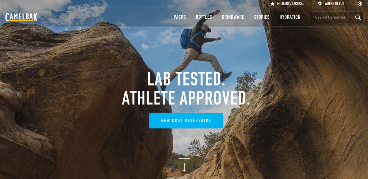
Users should also be able to easily find content within your site. This means incorporating a search function that allows them to type in keywords related to the questions or needs they may have. As an example, look at how CamelBak‘s commerce platform allows users to search for any keyword in its search box at the top right.
Didn’t make the grade? Let’s see…
- Are relevant keywords used in title tags, heading tags, meta descriptions and in the site’s content?
- Does your website have a site map?
- Does your site have a search box?
- Are images optimized for search engines by using keywords in ALT tags and filenames?
5. Accessible

Once users have found your site through search engines, they should then be able to view it on any device, such as a smartphone, tablet, laptop or PC.
If your site isn’t optimized for mobile browsing, then you’re potentially losing out to competitors who are ahead of the curve. Take a look at how Ronin Amsterdam‘s site above resizes its content according to the size of the screen.
Since more than 50 percent of global searches now come from mobile devices, it’s generally accepted that creating a responsive website (that resizes content in accordance with the dimensions of a screen) is the best option.
If you’re not sure your site fits this description, ask yourself:
- When viewing your website on a mobile device, is the page layout rearranged depending on the width of the screen?
- Does your website rely on Flash to display content, animations or navigation?
- Do mobile users have to “pinch to zoom” in order to read the text?
6. Credible
Last, but most certainly not least, your site should establish credibility through both its content and design choices. Otherwise, how will visitors trust and believe what you tell them?
According to research conducted by Stanford, website visitors many times judge a site’s credibility by visual design alone, including the quality of images, layout, and consistency between pages.
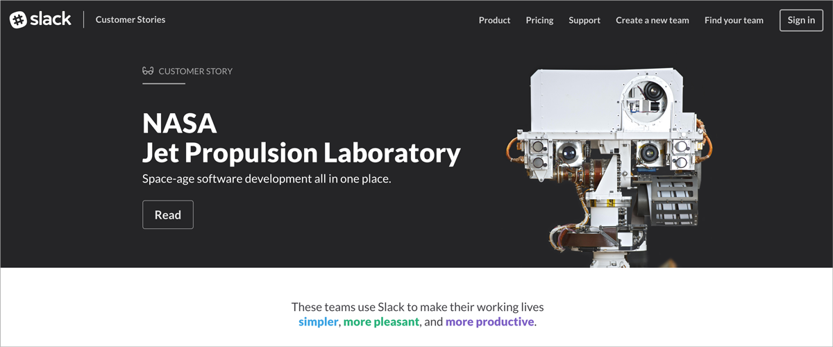
But beyond design, visitors also notice if the information on your site is accurate and supported by third-party references, such as customer reviews and links to articles. Look at how the popular messaging app Slack leverages customer stories to instill confidence and trust in its users and investors.
In terms of performance, it goes without saying that error messages, broken links, and a site’s failure to load will hurt its credibility.
For sites that allow online transactions, the lack of encryption and authentication standards will certainly dissuade visitors from entrusting it with their personal information.
To further evaluate your site, ask yourself:
- Does your site take longer than two seconds to load?
- Does your site use SSL encryption?
- Does your site include social proof in the form of reviews and links to press mentions?
- Does your site include employee bios as a way to convey trustworthiness?
- Is the site free from server-side errors?
Your Turn
Still not sure if your website makes the grade? Take this quick website grader assessment in less than five minutes to receive your website “report card.”


Leave a Reply