When it comes to web design, many of the same trends we saw in 2015 will continue to dominate the visual landscape.
Beyond a refinement of the modern minimalism that has dominated the web design world since the release of the iOS7, there are some much-anticipated changes on the horizon–and others not so anticipated.
Here are some of the trends that will take the Internet by storm–and others that will simply continue their current course of evolution:
1. Flat Design–But Better
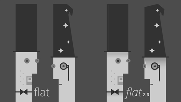 One of the key trends of the 2010s–flat design–is here to stay, but not without some noticeable improvements.
While it may seem that flat design is a relatively new fad, you can trace its origins back to the 1940s and 50s, when the Swiss Style came into existence.
Like most design trends, flat style is simply a reappearance of an older design trend that featured some of the same characteristics: extreme minimalism, grid layouts, san serif fonts and the absence of any three-dimensional elements, such as shadows and gradients.
As pointed out by Ryan Allen, flat design is evolving into what has been dubbed as Flat 2.0. In other words, it’s flat design–but better.
To get a clearer idea of the exact differences between the two, just take a look at the image above. On the left, you can see a design completely devoid of any three-dimensional elements. On the other hand, the design on the right incorporates highlights, gradient shadows and dropshadows.
According to the UX design platform UXPin, the new and improved version of flat design makes use of the following eye-catching elements, while still remaining predominantly flat:
-
Long shadows
-
Bright hues
-
Sans serif
-
Ghost buttons
-
Minimalism
2. Functional simplicity
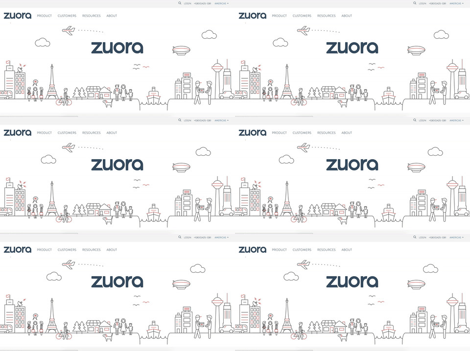
Another trend which will follow its current trajectory of evolution is functional minimalism. Characterized by the elimination of elements that distract users from the main content of a page, minimalism will continue to dominate the web both for its simplicity and elegance.
Although it may seem that this trend should make things easier for designers, the opposite is actually true. Since minimalism attracts more attention to the few objects on a page–be it three, two or as little as one main element–these must be chosen with the utmost care and deliberation.
3. Originality
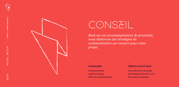
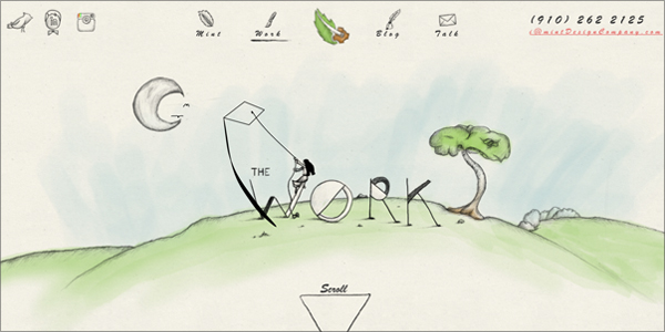
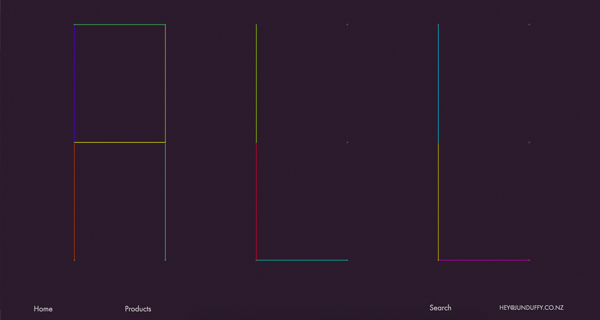
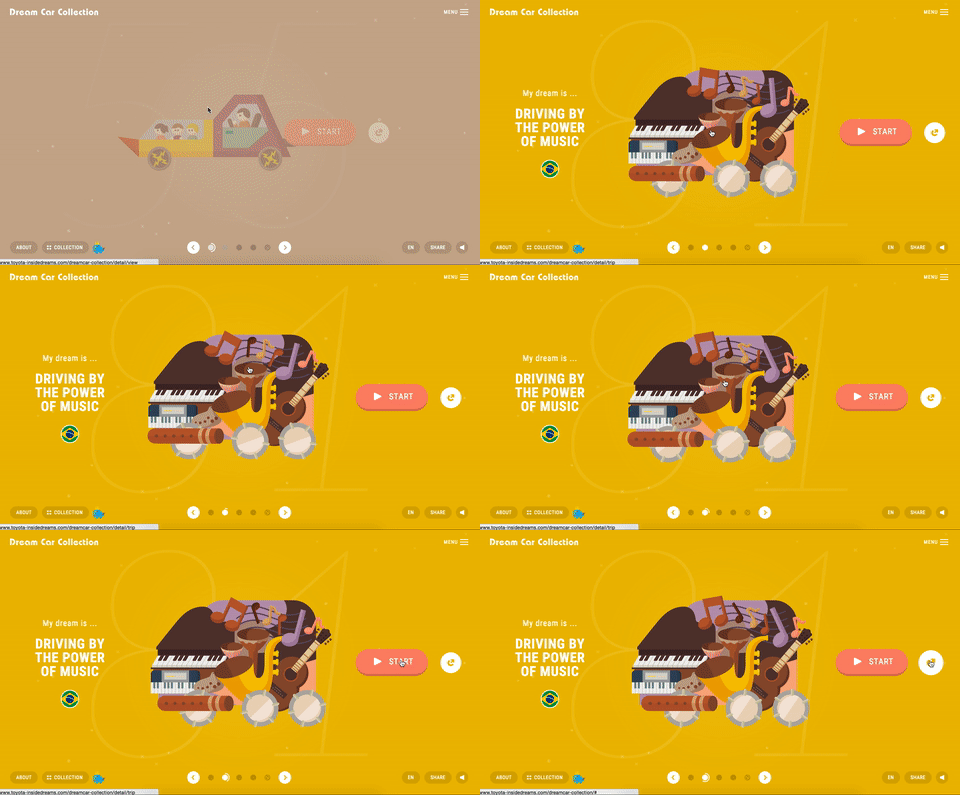
In line with the current trend of replacing anything that looks mass produced with custom products, original creations such as hand-drawn elements will probably increase in popularity.
Sites such as the one above, which combines custom illustrations with detailed animations, will most likely be followed by those who want to differentiate themselves from thousands of other sites that provide a similar user experience.
4. Container-like design
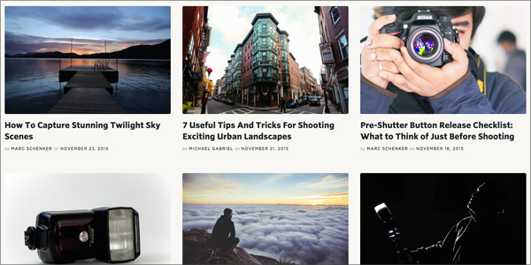
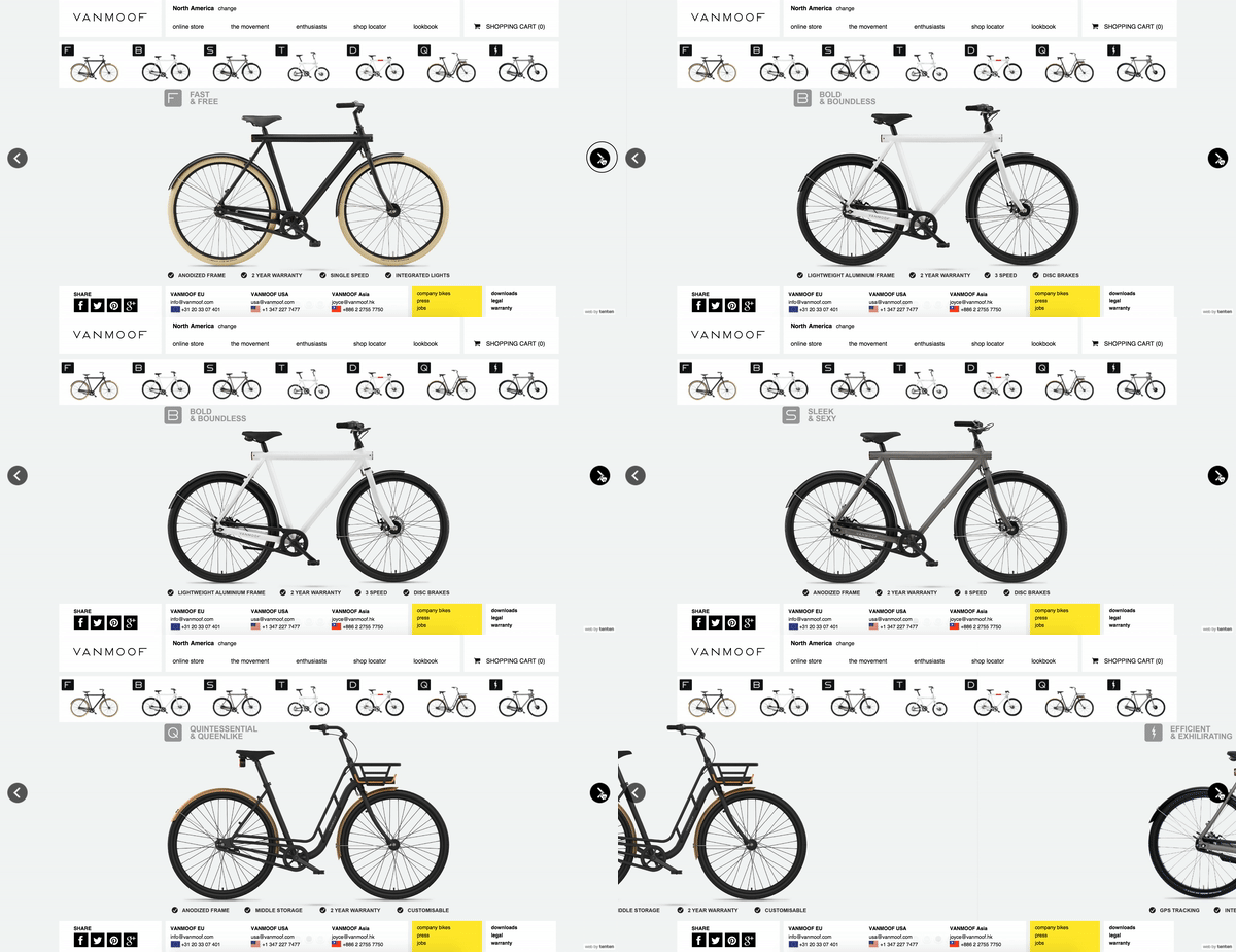
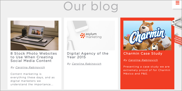
In 2016, we’ll likely be seeing more of the card UI patterns that were made popular by sites such as Pinterest and Google+. Harmonious and functional, this grid-based design is well-suited for a web world that espouses functional minimalism and elegance.
In the above example. the photography magazine Contrastly uses this grid pattern to achieve an intuitive UI in which the user immediately detects a visual hierarchy of information (the most recent information is found at the top, while each successive row descends in order of newness).
One of the key advantages of using this type of design is the ability to present self-contained bits of information in a logical and easy-to-understand format. On the downside, if not done right, this design can look cluttered and risk appearing too much like Facebook or Pinterest.
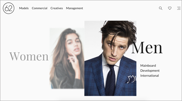
5. Typography with a dramatic flair
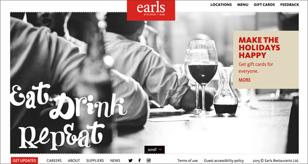
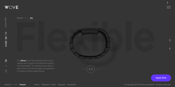
Beyond achieving legibility, typography is another design choice that communicates a message all on its own.
Some of the characteristics of this type of typography include:
-
Extremely large or extremely small typography
-
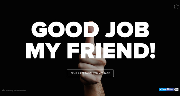
Typography superimposed over images
-
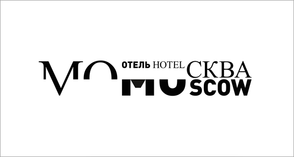
Typography used in unconventional ways
-
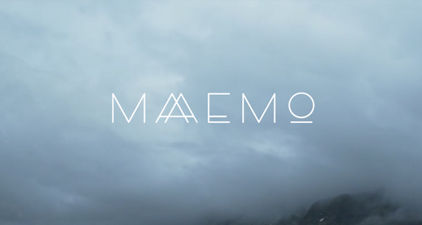
Designing your own typography to reflect your brand
-
Combining the above techniques (e.g.: extremely small and large typography)
 6. Increased interactivity
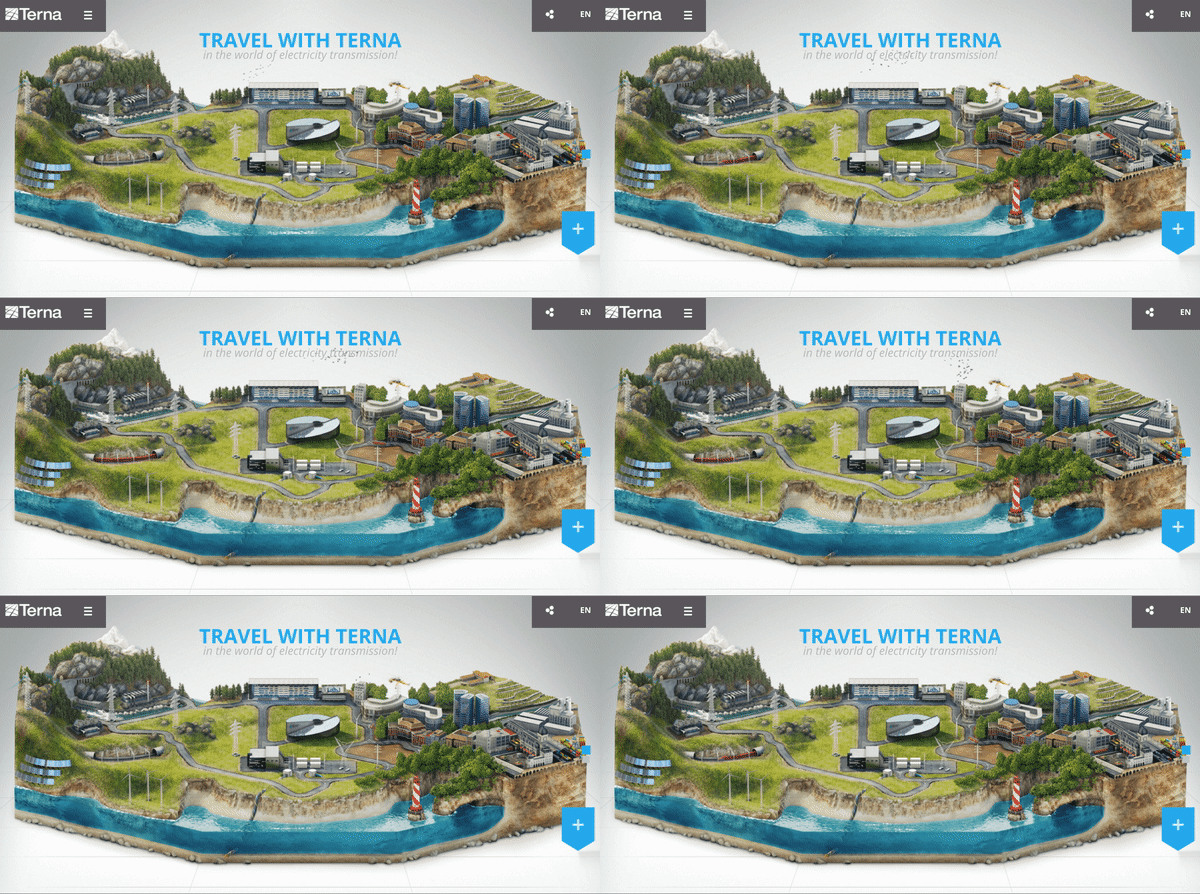
In order to provide a more immersive experience for users, interactivity will continue to characterize sites that aim to enthrall and engage visitors, from the moment they land on a page to the moment they leave or make a purchase.
Some of the features found in interactive and immersive sites include:
- Card UI pattern
- Micro-interactions (the small interactions between a user and a site that add up to create an overall experience, such as filling in a form)
- Long scrolling
- Parallax scrolling
- Clicking and swiping
- Animation and video
- Smooth transitions
7. Innovative animations
The demise of Flash hasn’t resulted in the disappearance of animations; to the contrary, the increasing popularity of CSS animations has opened up a whole new world of possibilities for web developers and designers.
Some of the most-used animations in 2016 will continue to include:
-
Loading animations
-
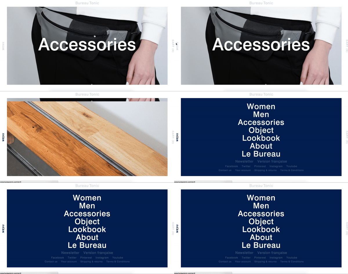
Animation used to reveal hidden menus
-
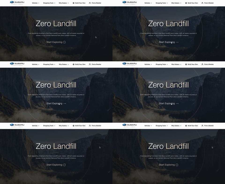
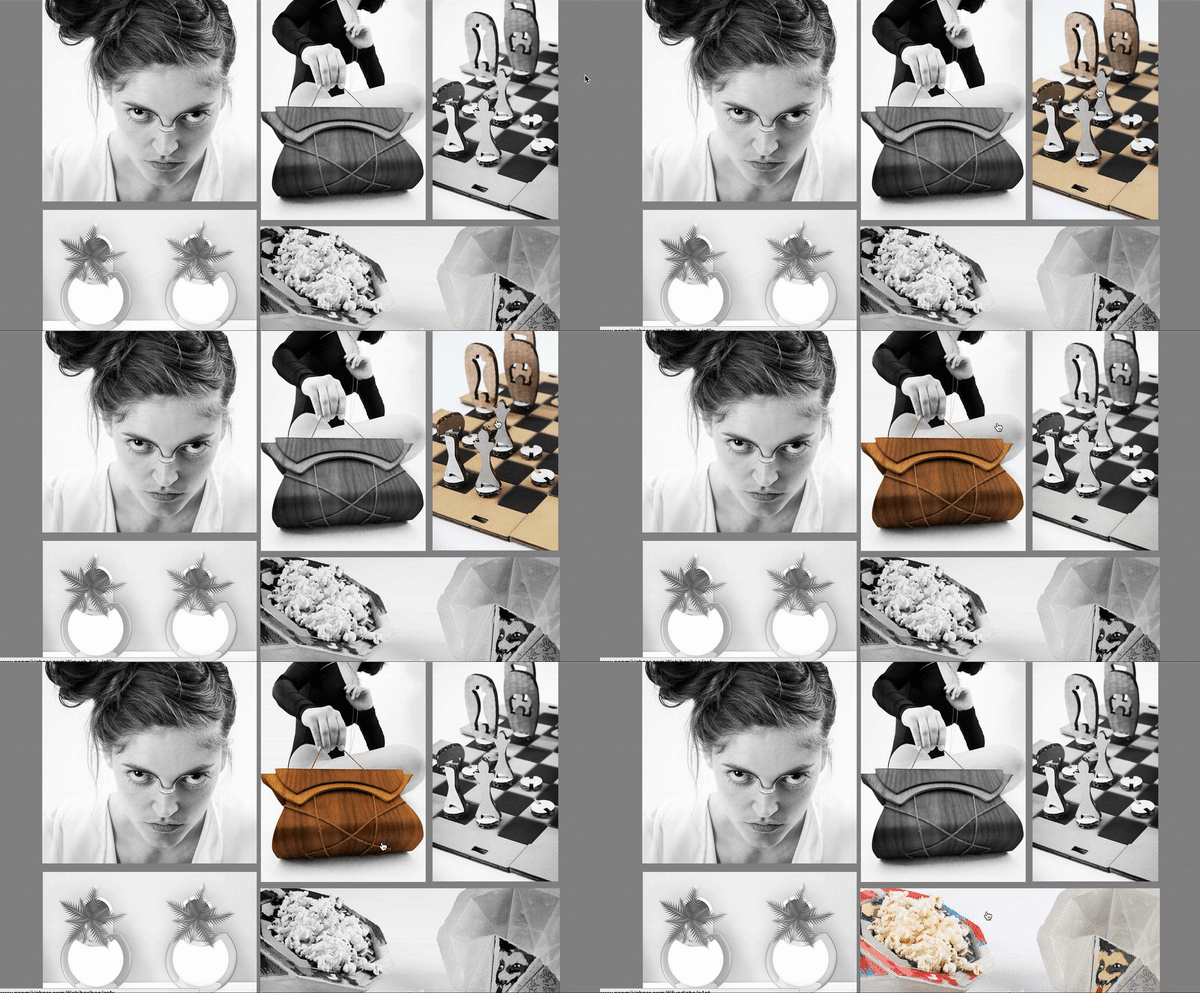
Hover animations (appear when cursor moves over an element)
-
Slideshows
-
Subtle motion
-
Motion activated by mouse movements
-
Animations in the background
8. Bold use of color
The use of vibrant, bold colors is not only increasing in popularity, it is also becoming more acceptable on so-called professional sites. This trend combines especially well with flat design principles since it prevents a minimalist site from appearing too boring and simplistic.
A few of the trends that will continue to dominate the web design world include:
-
Monochromatic schemes
-
Bolder use of accent colors
-
Color modified in accordance with a card-based layout
-
Color that changes when cursor hovers over an element
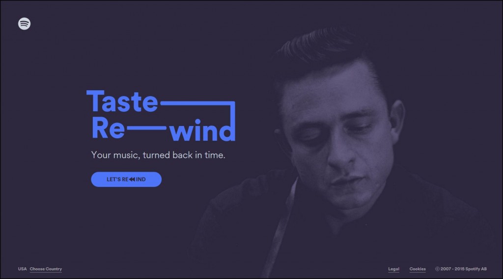
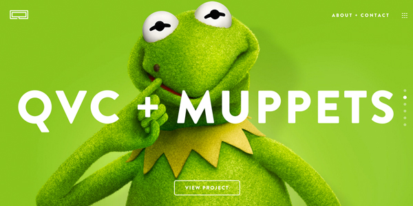
9. Hero headers
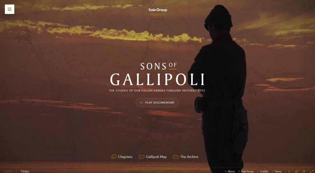
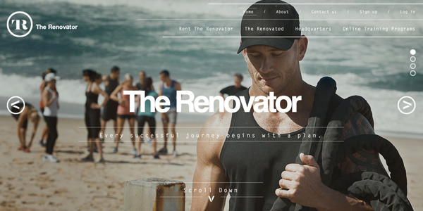
Another trend that is here to stay for 2016 is the use of large HD hero images that grab your attention right from the outset. These usually appear as hero headers, which immerse the visitor through the use of stunning photography combined with text, an image slider, animation or a video.
10. Storytelling and interaction
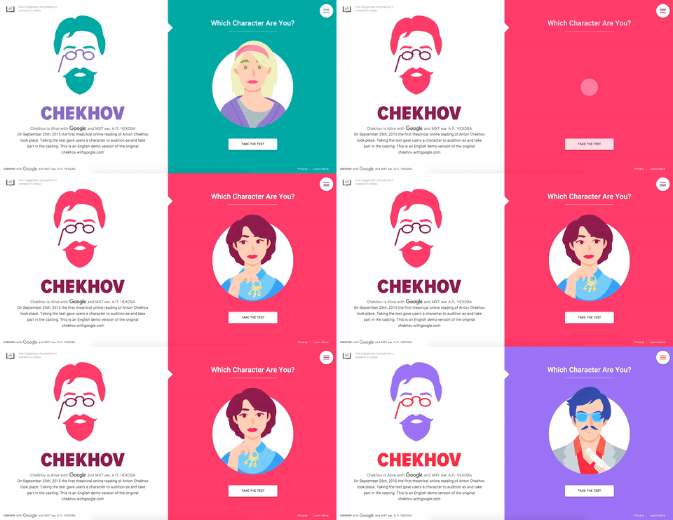
One of the things that separates a well-designed website from an exceptional one is the way it facilitates interaction with the user.
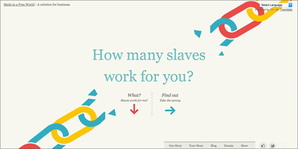
In the above example, the The Slavery Footprint site goes beyond providing a smooth user experience to making the visitor feel like a character in a story. This not only allows for increased interactivity–using a guided questionnaire as a means to make the site about the visitor and not the organization’s cause–it also implements storytelling, which is a powerful technique that has repeatedly shown to engage audiences more than disjointed information that lacks a narrative.
11. Long scrolling
Although there are some who are not particularly fond of the long scrolling trend, it seems that we’re going to continue to see more of this in the year to come.
One of the main advantages of this tactic is the fact that it engages users for a longer period of time in comparison to sites where the same amount of information is spread out across several pages.
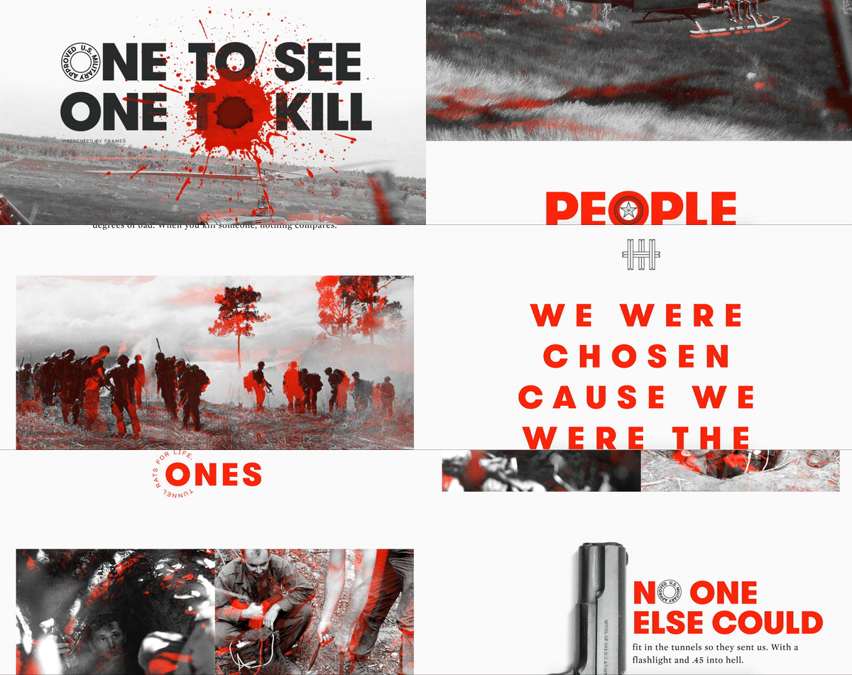
Take the above example, for instance. Through the use of the long scrolling feature, the author is able to tell a rich story that unravels seamlessly and naturally on the screen–and at the reader’s own pace.
Which of these web design trends interests you the most? We would love to hear your reactions and thoughts. Or if you have any questions about how you can implement this on your own site, drop us a line in the comments section below!

I can not tell about the trends in all over the world but in local I have seen that most of the clients at ecommerce solutions in jaipur
were demanding for Storytelling and interaction and it is also very attractive and it gives a creative to the website.
Thanks for the comment. Yes, this is true. Creating user experiences through storytelling is what makes the difference.
Each trend is attractive itself. As for Long scrolling, is it really convenient for user? The scrolling is very fast and it is distracting in a way.
Excellent list for ideas and creativity