 The famous line “If you build it, they will come” might have been true for Kevin Costner in Field of Dreams, but in the real world of entrepreneurship, the mere fact of creating a website doesn’t guarantee that visitors will flock to your site in droves and become loyal customers.
In fact, a study shows that visitors will take only 10 to 20 seconds to skim your site and decide whether they want to stick around or not.
What is it exactly, though, that draws the dividing line between withdrawal and engagement in a first-time visitor?
Years of research reveals that site visitors are not easily won over by flashing lights, urgent calls to action, enticing buttons that lead to something other than expected or any other form of manipulation—they’re much smarter than that.
If you really want to attract visitors and—most importantly—get them to stay, read through the following top reasons why users abandon sites and determine whether or not you’re guilty of any of these “cardinal sins” of web design.
1. Missing contact information
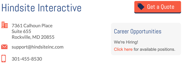
One of the fastest ways to lose credibility with your visitors is to omit contact information such as phone numbers, email addresses and a physical address.
In a 2014 B2B Usability Report, more than half of those surveyed abandoned a site after noticing the lack of full contact information. While we do live in a digital age, visitors still want to be reassured that there are real people behind a website and that they’re dealing with a legitimate company with reachable headquarters.
2. Poor navigation and content structure
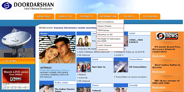
Has this ever happened to you? You’re looking all over a website for a key piece of information and can’t find it due to a poor navigation structure; or worse, you’re confused as to what to do next and don’t know where to go.
This is probably one of the worst transgressions you could commit in your mission to capture more users. If you want your users to feel welcomed and engaged rather than confused and irritated, avoid scattering your main navigation links; place them instead in a central area where they can be easily found.
Also, create a site with the user in mind by implementing clear labels and organizing items in accordance with the visitor’s goal rather than the products’ features and categories. Group similar content in one place instead of distributing it across several pages.
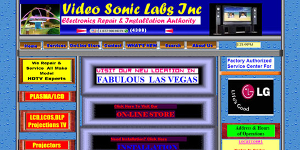
3. Unattractive design
We’ve all heard that we shouldn’t judge a book by its cover, but the truth is that being attractive makes others believe that you are more competent and, therefore, more trustworthy. This is not only true of people, but of websites as well.
According to a study conducted by the University of Melbourne, visitors interact with sites much in the same way they interact with people. Compared to five years ago, users are now more likely to become engaged with attractive sites that communicate professionalism and a sense of trustworthiness. In other words, looking good is equated to being good and being credible.
Another study conducted by Stanford University also found that Web users quickly notice when a site is poorly designed. In judging a site’s credibility, for example, those surveyed frequently commented on the fonts, layout, color scheme and graphics used.
4. Distracting elements
A particularly irritating web design transgression is the use of needlessly ostentatious elements that disrupt viewers’ navigation experience. From distracting banners and flashing ads to animation and video and audio that plays on its own, these intrusive elements don’t impress visitors—they just annoy them to the point of driving them away.
5. Excessive use of hyperbole

“The best pizza in town.” “The fastest Internet service.” “The most effective solution.” We’ve all heard marketing hyperbole before but when it finds its way onto your website copy, it can cause your credibility to take a nose dive. In this digital age, users have been trained to automatically distrust products and services that claim to be the best in their class when in fact there are dozens others who offer something similar, if not better.
6. Lack of social proof
As further evidence that websites are a reflection of real-life interactions, your site will also be judged by what others are saying about it. If there is no mention of the clients you’ve worked for, no reference to media coverage of your product or service and no list of established organizations you’re affiliated with, then you can be sure that your visitors will find it hard to trust you. An effective way to build credibility is to use testimonials given by real people, with real pictures and details of what they do and who they work for.
7. Stale content
It might not seem very important to some business owners, but having a regularly updated blog does two things: it allows visitors to get to know your organization better and it builds trust by showing that you’re willing to freely share your valuable expertise. If done right, a blog can act like the vital sign of a company: it lets users know that it is alive and well, as opposed to out-of-date and perhaps even out of business.
8. Error-ridden copy
There’s nothing worse than web copy riddled with grammar and spelling errors. It tells visitors one of two things: either you have poor language skills or you’re not meticulous enough in your work to take care of details. Whichever is the case, this speaks volumes of the kind of service they might expect to receive from you.
9. Login walls and “Contact Us” forms
Usability tests reveal that there are few things that annoy visitors as much as login walls, which prevent users from getting access to information about products or services before registering. Not only is this counterproductive—you want the visitor’s first experience with the site to be a pleasant one—it is also counterintuitive since potential customers should have the opportunity to browse what you’re offering before they’re compelled to go any further.
Another no-no is forcing visitors to fill out “Contact Us” forms that ask for more information than customers are willing to give instead of providing direct contact information such as an email or phone number. Although there’s nothing wrong with these types of forms per se, they’re the most ineffective type of lead generation when used as an easy way to create mailing lists while leaving the inquiring customer clueless as to when they might receive a response.
10. Copycat sites
Cookie-cutter sites that copy the competition and parrot the same old banalities are likely to repel the most discerning visitors. One of the most effective ways to get visitors to know, like and trust your site—the three essential ingredients to a long-lasting relationship—is to strive for both authenticity and originality.
11. Lacking personality
Websites that lack flavor and personality—and are just plain useless—are another big turnoff. While a minimalist design is particularly effective when done right, it can spell disaster for your online presence when executed by someone who doesn’t have the adequate experience.
Generic web copy that seems like it could have been written by anyone is also a costly mistake. While you should steer clear of industry jargon that means little to first-time visitors, you do want to employ incisive, engaging and pithy statements that communicate a clear message about the benefits of your offer and reflect the personality of your brand.
Also, a lack of interactive elements such as forums, blogs and special features will make visitors feel disengaged, leading them to think that they could better spend their time elsewhere.
12. Using clickbait

Making promises you can’t keep is a surefire way to shatter credibility. There are many examples of clickbait offering everything short of the sun, moon and stars—only to lead visitors to a site that doesn’t live up to all the hype. Be careful to highlight the positive aspects of your products and services without overdoing it.
13. Not mobile-friendly
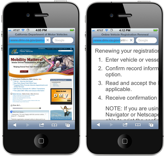
More and more visitors are accessing sites from their mobile phones, so if your page can’t be properly viewed from one, chances are that these users will simply look somewhere else for a solution.
14. Unclear offer and no prices
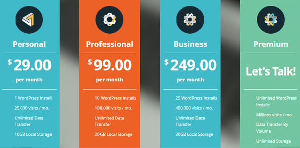
An obvious reason why visitors would quickly abandon a site is the lack of a clear message. According to the 2014 B2B Web Usability Report, 83 percent of respondents clicked back out of a site because they couldn’t tell right away what the company was offering. When customers visit a website in search of a specific product or service, they’re also expecting to find clear pricing information. Many sites make the mistake of leaving out these figures, only to find that their one-time visitors have decided to go with a competitor who did provide this information.
15. Low-quality content and stock photos

Although you might be tempted to settle for mediocre content just to say that you have material to offer, anything that is not well-researched and well-written is likely to do more harm than good. Likewise, the use of generic stock photos of smiling business people and handshakes is another turnoff. If you’ve decided to publish content, go all out: use material produced by experts and real photos with informative value.
16. Do-it-yourself sites
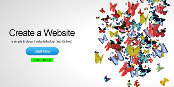
There are plenty of easy-to-use website builders out there nowadays, but if you want to have a polished, professional-looking site, it’s best to trust the experts with such an important part of your marketing strategy. You might be tempted to do it yourself or hire a friend to do it for a low price, but beware: you get what you pay for.
17. Missing “About” page
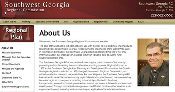
Marketing expert Chris Lake notes that there are many businesses out there that have an aversion to “About” pages. This is inexplicable since one of the first things many users search for when visiting a site is information on the company and its background. Again, you want to build trust and credibility with your potential customers–omitting information on what you’re all about is not the way to do it.
18. SEO-driven copy
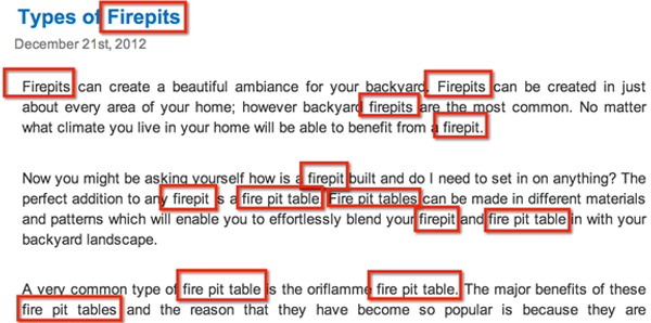
Some of your most savvy users will be able to detect SEO-driven copy from a mile away. If your content is stuffed with keywords and written more for search engines than people, then you can bet that your visitors will not stick around for long.
19. Sensationalized titles
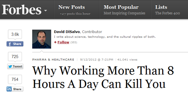
A recent data-driven study conducted by Hubspot found that Internet users are becoming increasingly wary of headlines with superlatives and overused words such as “magic,” “secret,” “tip,” “easy,” “free,” and “trick.” This just goes to show that the more you try to reel visitors in with manipulative tactics, the harder it is to gain their trust in the long run.
20. Malfunctioning website
Lastly, make sure that all parts of your site are always up and running smoothly. Just like egregious errors, broken links and pages that are “under construction” will lead your visitors to associate the malfunctioning parts of your site with the kind of service you will provide.
Leave a Reply