 The single most important site statistic is your conversion rate. Whether it’s increasing clicks to a certain page, driving leads or closing sales, your conversion rate is going to determine your actual profit margin. While many may focus their attention on increased marketing efforts and content production, one easy way to boost your sales volume is by increasing your conversion rate.
Think about it: If your conversion rate is 2% and you attract 1,000 prospective customers to your site, then you’ll end up with 20 new clients. But, if you increase this rate by a mere 1%, you would secure 30 new clients. This is a 50% increase that can be achieved just by changing a few things on your site.
To help you increase your conversion rate without having to give your site a complete makeover, try these useful tweaks and tips which have worked for other sites:
1. Use images of real people
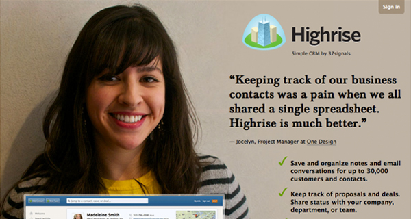
You might just love your stock photo collection of gorgeous, mutli-ethnic people, but trust me, you can do without them. The company Highrise, for example, increased its conversion rate by an astounding 102% just by using giant images of real people, like the one above of a beaming customer.
2. Place call-to-actions on the left side
Eye-tracking tests reveal that since people read from left to right, they spend 69% of their time on the left side of a web page. With this in mind, place your call-to-action buttons on the left-hand side instead of the center or the right.
3. Implement a single-page checkout process
After comparing conversion rates of a one-page, two-page and four-page checkout process, a case study found that the single-page checkout process was the clear winner, with far lower cart abandonment rates.
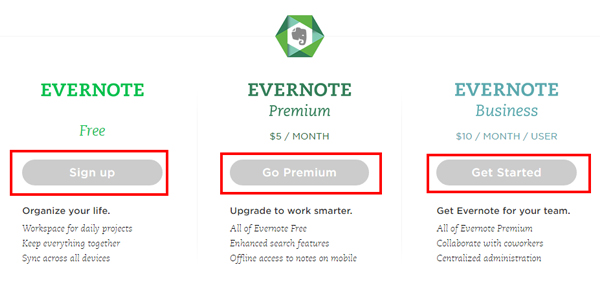
4. Use a stronger call-to-action button
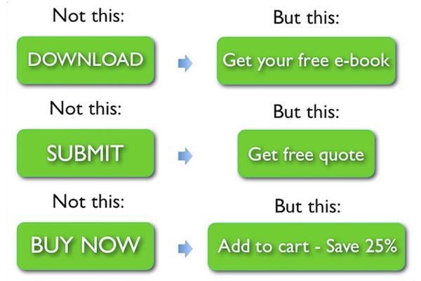
It might seem like a small detail,, but the wording of call-to-action buttons has a huge impact on conversion rates. Dustin Curtis, for example, got a 173% increase in conversion rates by using the phrase, “You should follow me on Twitter.”
5. Reduce the number of fields in your forms
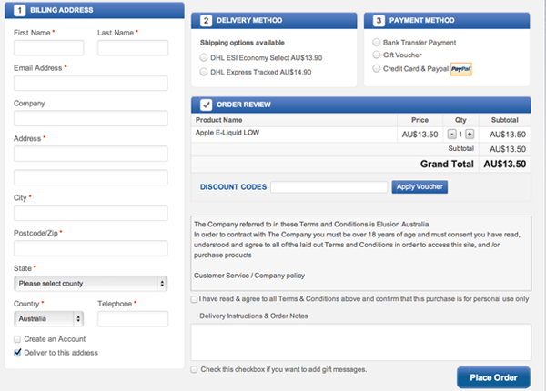
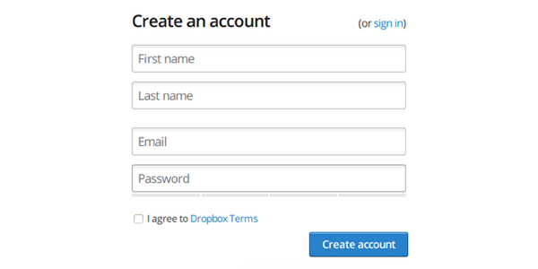
When requesting personal data through an email opt-in form, try asking for as little information as possible. This test, for example, revealed how using one additional form field decreased the conversion rate by 11%.
6. Improve the usability of your site
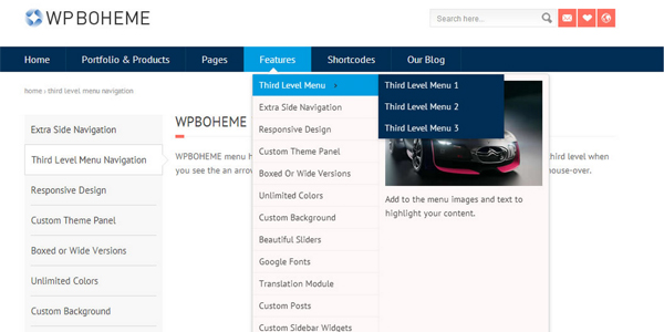
The website Bizztravel improved their conversion rate by 21.34% by adhering to the usability best practice of having a navigation menu on their home page.
7. Simplify your website
Underwater Audio saw their conversion rates increase by nearly four times (261%) by simplifying their website and removing detailed product information.
8. Place a trust seal on the site
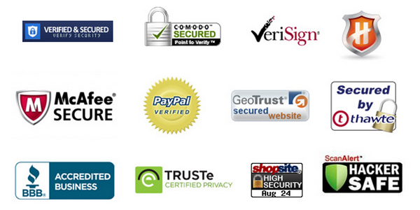
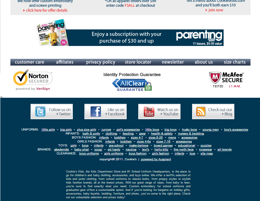
The online retailer Bag Servant boosted it conversion rate by 72.05% by using a trust badge on the top part of its home page.
9. Modify your pricing page
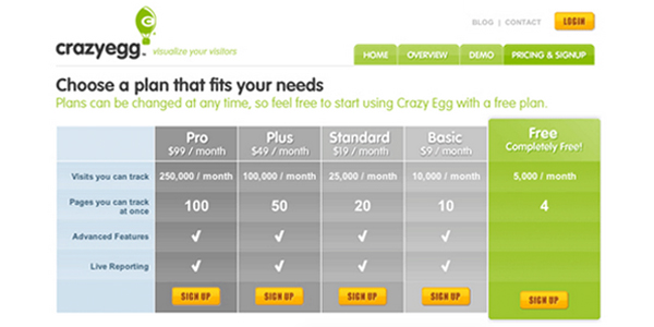
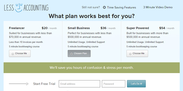
The website builder BaseKit achieved a 25% hike in their conversion rate by simply modifying their pricing page. Compared to the old one, the redesigned one features clearer prices, bolder and brighter colors and, overall, a more obvious currency selection.
10. Add authentic testimonials
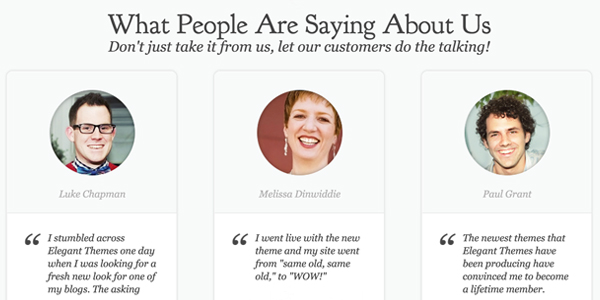
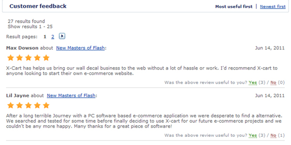
Many sites use testimonials, but not all of them are done right. Check out these awesome testimonials and how they implement video as well as links to more detailed case studies. A few testimonials, however, is better than none, as evidenced by this case study which documents how WikiJob increased its conversion rate by 34%.
11. Use product videos
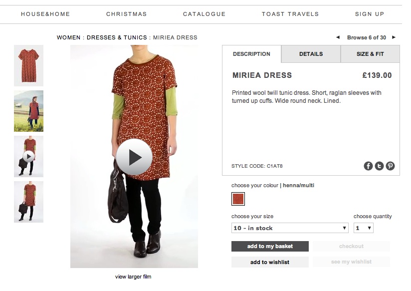
In online retail, using video allows the customer to get a 360-degree view of the product they are interested in buying, which could also potentially reduce returns. The sport supplier Ariat, for example, experienced a 160% boost in their conversion rate for one product after adding a video.
12. Try red call-to-action buttons
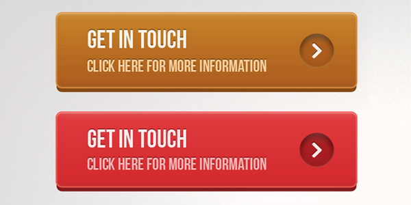
Although many might think that red is not the most appropriate color for a call-to-action button–after all, it means “stop,” right?–a test conducted by Hubspot found that red outperformed green as a button color by 22%.
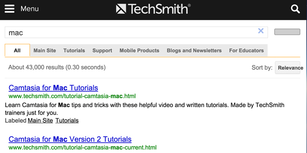
13. Incorporate Google Site Search
The distributor Waterfilters.net decreased their bounce rate by 4% and increased their conversion rate by 11% by implementing Google SIte Search.
14. Provide more content
Middle-of-the-funnel content such as ebooks, templates, case studies and email marketing can help convert leads into paying customers. Look at how the couple behind the website Flipped Lifestyle significantly increased sales by going full force with email marketing.
15. Use live chat
Since visitors often have questions that go unanswered when they visit your page, incorporating live chat can be useful for increasing your conversion rates. Blue Soda Promo, for example, started using live chat and saw that 60% of their conversations with visitors led to sales.
16. Add social proof to your home page
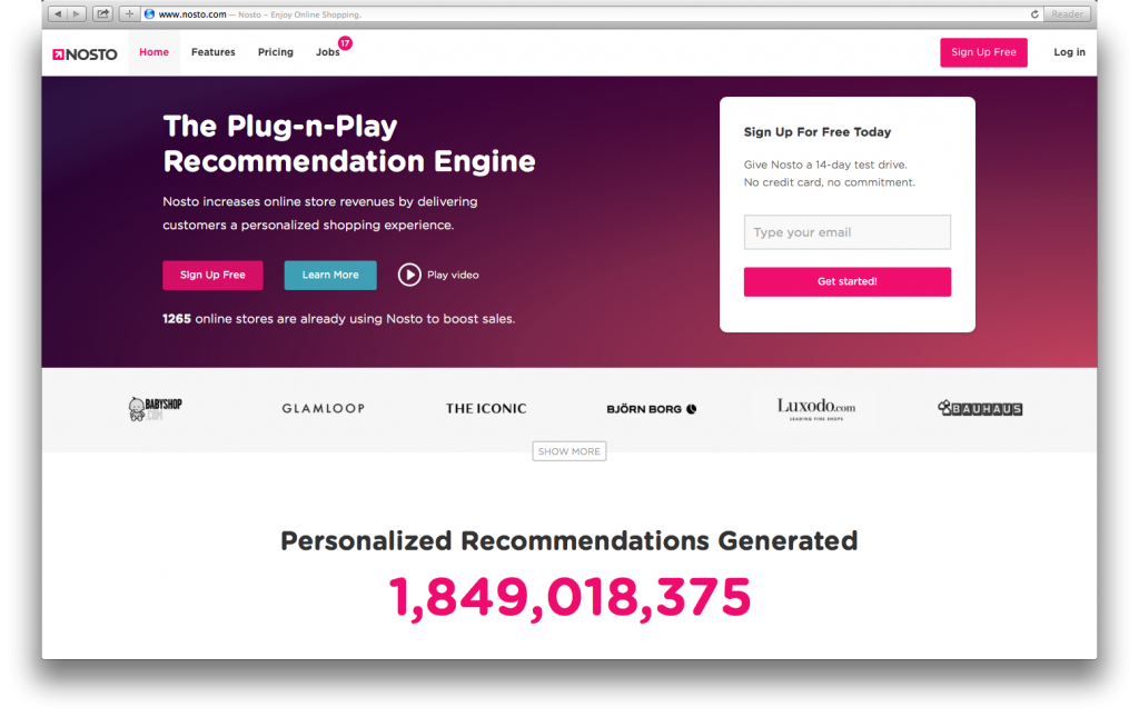
Most visitors want to see proof that they’re not the only ones buying into your offers. To ease their fears, provide social proof on your home page either by featuring your clients’ logos or referencing reviews written on your product or service. Orbit Media reportedly saw a 1400% increase in its subcriber conversion rate by using the phrase, “join X others.”
17. Change your headline
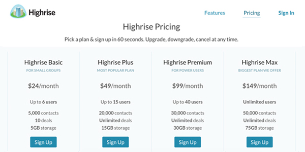
The company Highrise experienced an increase in its conversion rate after experimenting both with the wording and positioning of its headline.
18. Focus on referral traffic
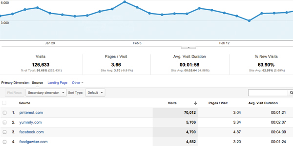
The numbers clearly indicate that referral traffic tends to convert better than leads from direct traffic, organic search and social media. In fact, referral traffic converts 4x the rate of organic search.
19. Add a guarantee security seal
A case study shows how Understand Quran Academy increased its converison rate by 32.57% by using a “100% Money Back Guarantee” badge. Find out about the top 5 most useful badges for increasing conversions here.
20. Improve website flow
Zen Windows achieved nearly a 3% uptick in its conversion rate by redesigning the site so that users could navigate it more easily and smoothly, leading to a specific action.
21. Try a different image on your landing page
Even big names like Dell can experience huge increases in conversion rates just with a few tweaks. After redesigning its landing page so that it featured a mega background image instead of the small image they were previously using, Dell experienced a 36% increase in leads and a 27% reduction in bounce rates.
22. Add product reviews
Figleaves.com observed that when they added reviews to their products, it increased the conversion rate by 12.5%. Also, they reported that products with 20 or more reviews enjoyed an 83.85% higher conversion rate than those without reviews.
23. Change the wording of your call-to-action button
Sometimes the most minor changes can lead to the most drastic changes in results. One example is a test conducted by Unbounce.com. By changing one word in their call-to-action button–from “Start Your Free 30 Day Trial” to “Start My Free 30 Day Trial”–the site experienced a 90% increase in its click-through rate to the payment page.
24. Feature a discounted price
One wine ecommerce site witnessed a surprising 148.3% hike in their conversion rate simply by slapping on a 15% sticker to one of their products.
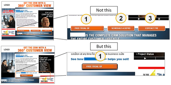
25. Make your call to actions easy to find
By using a contextual call-to-action button within its content, Nature Air experienced a jaw-dropping 591% increase in its conversion rate.
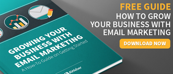
26. Use a 3-D cover for your ebook
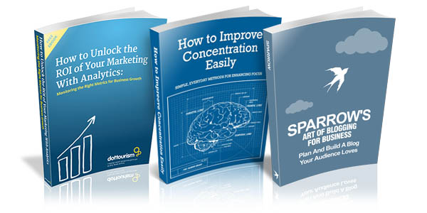
John Corcoran details how he increased the conversion rate on his sign-up form from 3.2% to 5.2% by creating a new 3D cover for his ebook.
27. Test your value proposition
Sims 3 was able to get more people to register for its games by changing its value proposition so that it emphasized a free trial. This caused game registration to increase by 128%.
28. Present a few choices
Studies show that when you present consumers with too many choices, you actually generate less sales and activate something called “action paralysis.” In one famous jam study, consumers who had 24 flavors of jam to choose from tasted various samples, but only 3% of them went on to purchase a jar. However, when only six were available, 30% purchased at least one jar of jam.
29. Use action-oriented copy
It has been proven that action-oriented and assertive copy can lift conversion rates by 30% or more. Use words that move the customer to action without being too agressive. Some examples include: “Find out now…” or “Super-charge your profits.”
30. Use aspirational images and copy
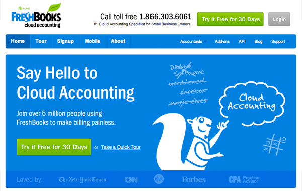
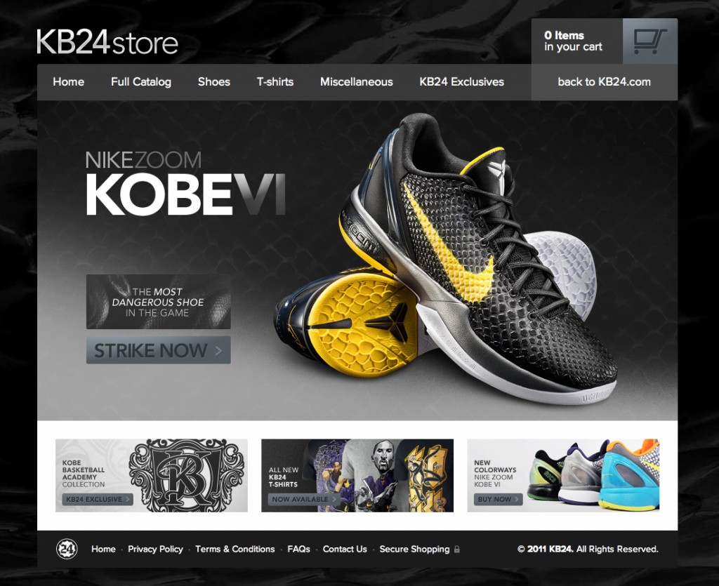
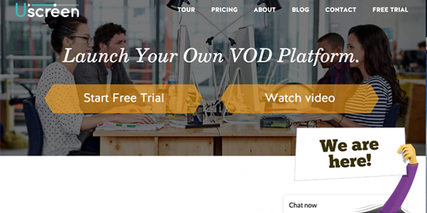
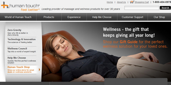
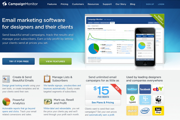
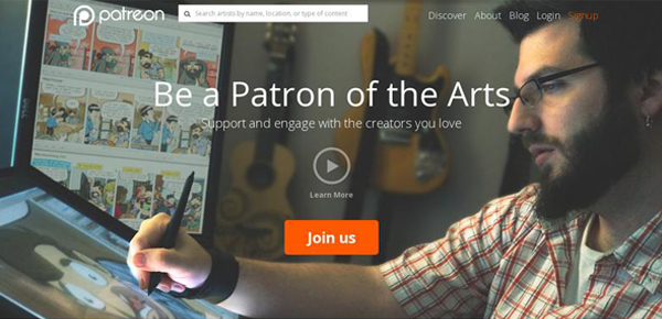
The use of benefit-oriented copy, along with images of activities your target audience aspires to and a prominent call-to-action button above the fold (as seen in the image above), is a proven recipe for success that will lift your conversion rates.



Leave a Reply