There is no denying that the use of mobile technology is the way of the future. For now that way is through mobile devices such as tablets, phones, and in a limited capacity, watches.
The global smartphone audience surpassed the 1 billion mark in 2012 and will total 1.75 billion in 2014. Just this past year, in the US, mobile users surpassed PC desktop users for the first time. That’s amazing!
The modern smartphone has only been in hand for a little over 10 years and even less for tablets, a mere 4 years. Due to these numbers, web designers and developers knew the web would need to be displayed more clearly for the growing user-base. Through this need, Responsive Web Design (RWD) was born.
What is Responsive Web Design?
RWD is an approach used by designers and developers to ensure that a website provides the optimal viewing experience across a wide array of devices (from desktop computer monitors to mobile phones). The information on your site should be accessible, in full, whether a user views your website on a desktop, tablet, or mobile phone. The idea is that the website would realize what device the user has and automatically respond to that viewing preference.
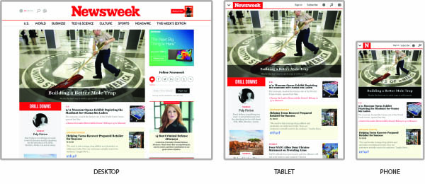
Take Newsweek.com as an example:
As you can see the site is heavily driven by content. It is important to Newsweek, that no information is lost when viewed on different devices. In all three views, the same content is present just restructured to the user’s preferred device.
Have you ever been to a website that wasn’t mobile-ready? Annoying isn’t it? All that pinching to frame a small portion of the site, then the ‘small screen squint’ to read the content. Scrolling back and forth to read each line of text. Then it’s on to fighting with the drop down menus just to navigate to another page. Fortunately, this test of patience is becoming less prevalent on the web. Many companies have aligned themselves with the benefits of RWD by implementing a mobile-first strategy.
Mobile-First Strategy
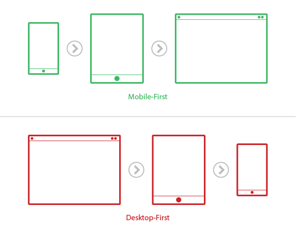
So, the decision has been made, you are on board with RWD and are looking to redesign your company or personal website. The first question that comes to mind is “What’s the next step?” We like to say, Mobile-First. A Mobile-First design strategy allows the mobile site development (the most involved version) to be created first, followed by the tablet and desktop versions. This tactic was developed a few years ago by developers and designers to solve a significant user pain-point. The user wanted to complete all the same tasks on their phones as they could on a desktop. When companies first made the shift to the mobile web, what was produced was a scaled-back version of the desktop site. Mobile-first relieves this pain by creating the small environment first without cutting content and functionality.  Some companies enjoy having a desktop site created first, so they can see the big picture, then continue onto develop the tablet and mobile versions. Take note, people will visit your site on their phones. If your site wasn’t created to look the absolute best on all devices, your customers will start to mistrust your business. On a subconscious level, the idea that you are not providing a valuable and common service to them, will cause skepticism on what else you don’t value. The mobile site is no longer a second-class citizen of the web.
What are the Benefits?
By designing for the small screen first, the UX designer must determine how the site will be navigated with the least amount of effort and frustration.
Clear Site Navigation:
In a smaller environment the user simply doesn’t have the real estate to get muddled with menu items and drop-down navigation. The rule of thumb for website navigation is no more than 6-7 menu items. A clear navigation is key to help direct each user to his intended destination. This will increase the amount of user conversions, whether that means more sales or newsletter subscriptions. Drop-downs have been removed from many site, and rightfully so. The tend to be problematic in a desktop environment, and do not translate to mobile devices due to the lack of a rollover function.
Solves Problems Quickly:
Several struggles appear when a company redesigns their website including site navigation, the order of important content and data, easy-of-use, and critical user functions. Mobile-first helps to breakdown and solve these tricky areas into a concise set of solutions. Many complications arrive when developing a desktop site first, then trying to squeeze that content into a mobile framework. With mobile-first, designers and developers uncover these issues first and resolve them early in the development process.
Focused on Content:
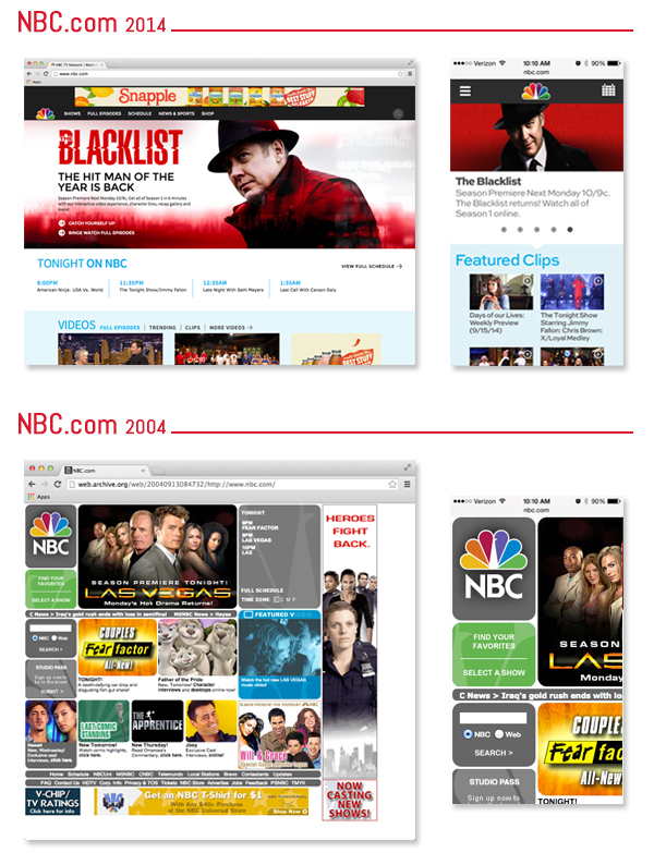
It is easier to fill a house, than it is to move from one, into an apartment. In the desktop environment there is a tendency to add functions, images and content to “fill space.” This inevitably reduces the amount of white-space or breathing room and creates visual clutter. In mobile-first there simply is no real estate for this to happen. The content displayed has to be clear, concise and easy to understand. When done correctly, the mobile-first approach positively affects the tablet and desktop versions of your site, resulting in a more clean and polished look. You can really see the difference ten years has made at NBC.com. Granted the smart phone had just begun building momentum in the consumer market, but that copped webpage from 2004 would have been the view from your iPhone 3G. Get ready to do some pinching and scrolling! 
Produces the Best Results
By implementing the Mobile-First Strategy, you will:
-
Define a clear site navigation, which will increase the number of users completing their intended tasks and converting.
-
Solve issues that arise on your site more quickly, thus creating a more efficient product.
-
Focus on the content into a simple and concise format, resulting with a more attractive and functional end product.
The web has changed many times in the past decade, and will continue to do so. The difference now is that users dictate how the web is formed, not companies. Sure, we facilitate avenues for them to traverse, but they call the shots. Change isn’t easy, especially in business, but it is a necessary evil. A successful tool to alleviate some of the anxiety during these changes is a Mobile-First Strategy. A great product should be shown the best way on all devices.


Leave a Reply