“Image is everything.”
Remember when Andre Agassi first made this line famous in the 1990s when he starred in this Canon commercial?
Minus the unfortunate green screen effect and Agassi’s mullet hair, this message could not be truer today. Image affects others’ perceptions of us and the way we are treated not only in real life, but online too.
According to a study conducted the University of Melbourne, people interact with websites in the same way they interact with people:
They first notice and evaluate the attractiveness of the page before they actually read any of the content. If it pleases the eye, it is deemed trustworthy and respectable; if not, many visitors simply leave altogether.
In line with this trend, websites are implementing, now more than ever, spectacular visual content in the form of beautiful HD photography, full-width hero images, engaging video, carefully selected fonts and bright, vibrant colors. Meanwhile, website copy has become ever so concise, taking a back seat to visual content.
Even big-name websites like Adobe and Apple have undergone drastic changes thanks to the rapidly evolving web design landscape. With the growing tendency to cater to mobile users looking for simplicity, speed and high usability, web designers must focus first and foremost on users and how to provide them with a pleasant and effortless browsing experience.
To help you stay in tune with the latest trends and elevate your website’s design so that it attracts attention and keeps it, we’ve compiled a list of famous website redesigns that can give you some inspiration for your own website makeover.
1. Apple
A leading innovator and household name, Apple has been–and continues to be–a trendsetter when it comes to design, both online and offline.
But even this big-name company has experienced some drastic changes throughout the years. Just take a look at what its home page looked like almost 10 years ago (click the image to view full-screen version).
Apple Home Page 1997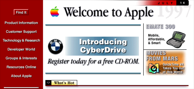
This flashback to the 90s lets us see just how unappealing web pages were back then. The saturated red, along with the huge chunks of text and overall confusing messaging, makes this an ineffective site that fails to send a clear message; it almost looks like a newsletter. Also, you can see from the screenshot that the Web was only 640 pixels wide in the 1990s.
Now, let’s jump to the 21st century and see what Apple’s home page looked like 10 years later:
Apple Home Page 2010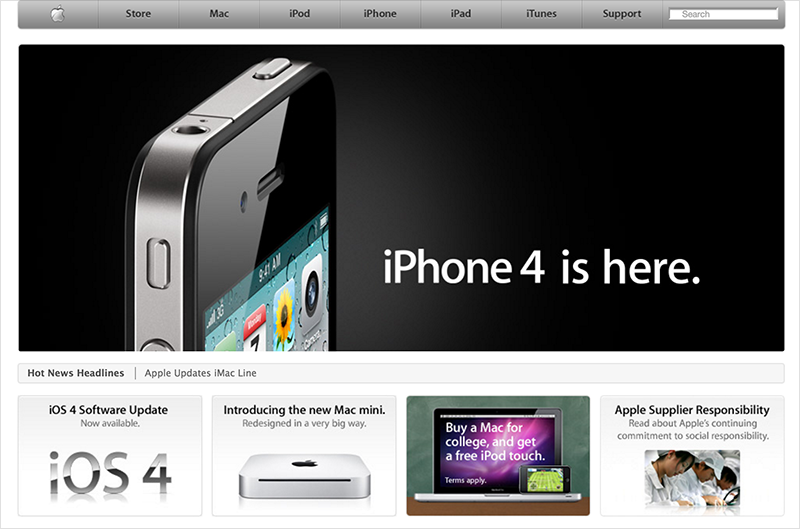
Big difference, huh? Here we see larger images, simpler menus, less text, more white space and the top navigation bar. However, we can still see some differences when compared to modern websites. Flat design had not appeared on the web design scene yet and hero headers (full-width images used in the header) were still not in use.
Now, let’s come back to the present day:
Apple Home Page 2016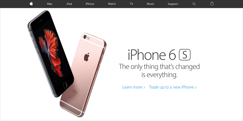
The spacious hero image, flat design and simplified top menu bar all make Apple’s new homepage not only much easier to look at, but also much easier to use.
2. Microsoft
Since the 1990s, website design has come a long way. Even Microsoft, the pioneer of modern desktop software, was restricted by the limitations of the time: basic CSS, only a few web-safe fonts and tables used for layout.
Besides very bland blue and white corporate colors, the site also errs on the side of clarity and usability with so many bloated menus and unclear messaging.
Microsoft Home Page (1999)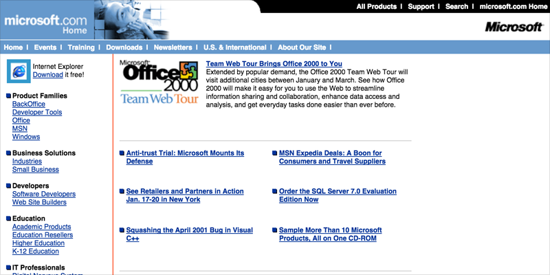
Then, more than a decade later, we still see some of the same mistakes in their redesigned home page. Although there is relatively less information vying for your attention, the visitor’s focus is still divided between so many different call to actions above the fold–in this case, four to be exact.
Microsoft Home Page (2010)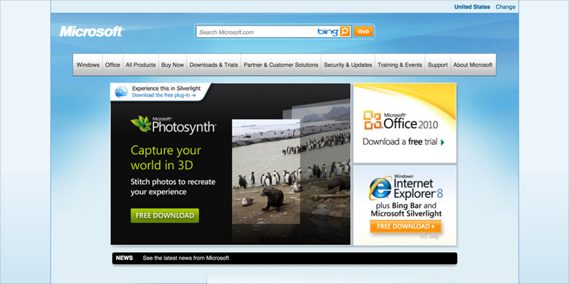
Fast forward to today: Here, we see large, spacious images, minimal text, clear messaging and lots of white space. All extraneous details have been eliminated, allowing the viewer to focus on the main message.
Taken together, these design decisions amount to a pleasant browsing experience for the viewer; like a breath of fresh air compared to the cluttered mess of previous years.
Microsoft Home Page (2016)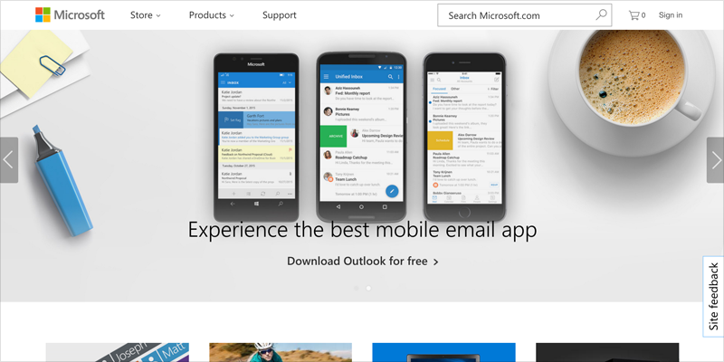
3. Adobe
Another big-name website that went through some of its own awkward coming-of-age years is Adobe.
Believe it or not, the design software giant had its own unattractive home page back when the Internet first started being used for non-technical purposes.
Take a look at the small screen size, the unattractive color and font combinations and the overall clunkiness of the site:
Adobe Home Page (1996)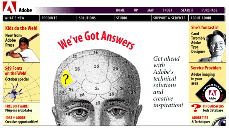
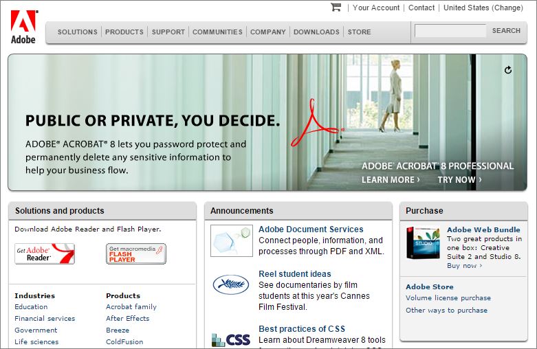
A decade later, Adobe’s home page already looks much better by implementing multimedia and eliminating the conflicting messages in the header.
Adobe Home Page (2006)
Jump to 2016, and the site looks a lot like most sites nowadays: A large hero image in the header; concise copy; a sandwich menu in place of the top menu bar; and a single call to action.
Adobe Home Page (2016)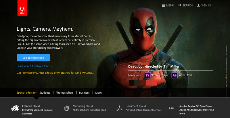
4. PayPal
Another big doozy is PayPal’s homepage back in the year 2000. A text-heavy site, with tiny images and an atrocious background color make this one of the worst we’ve seen, even if it did use shapes with curved corners, which was something of a novelty back then.
PayPal Home Page (2000)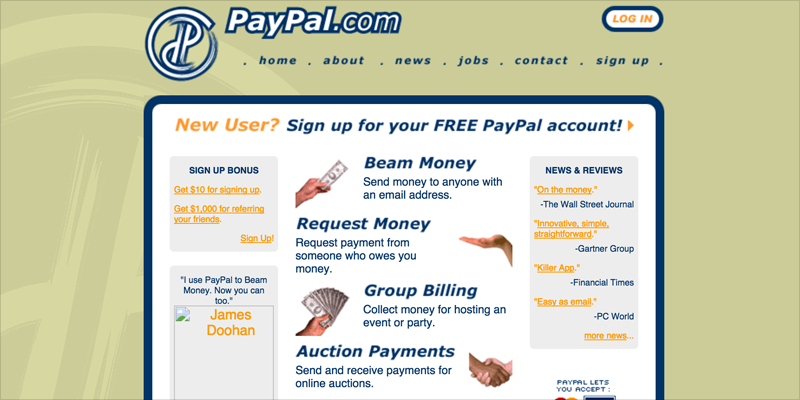
Jump to the year 2006, and we see still see too much text and tons of menus and hyperlinks that provide no clear direction to the user, leaving him/her with no idea of what to do next.
PayPal Home Page (2006)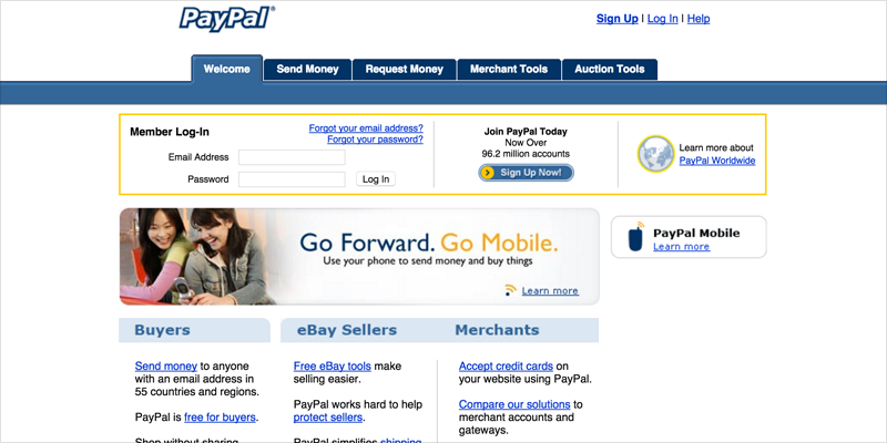
Let’s come back to the present moment and see what PayPal’s homepage looks like today:
(PayPal Home Page 2016)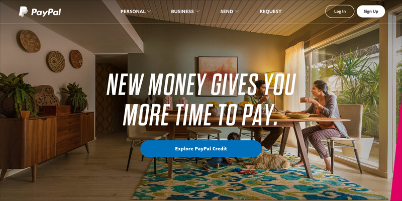
Now that’s much better, isn’t it? The use of hero images and bite-sized chunks of copy serve to prioritize the message above the design and extraneous details.
One factor that has significantly changed the look of websites over the years–and made them a lot simpler to navigate–is the diversification of the mobile market and the fact that over 60% of online traffic currently comes from mobile devices. To address this, websites are now built to adapt to all devices, from desktop computers to mobile tablets and phones.
The need to provide users with a website experience that is effortless on all types of devices–with a minimal amount of scrolling, resizing and panning–has led to the rise of flat design, which is the use of simple typography and flat colors in place of the gradients, textures and shadows used years ago.
The idea is to focus first and foremost on the content; 3D effects, the user interface and its support elements–such as the navigation, footer and widgets–all come second.
5. Skype
See how Skype used to apply gradients and shadows to its logo, buttons and call to actions?
Skype Home Page (2003)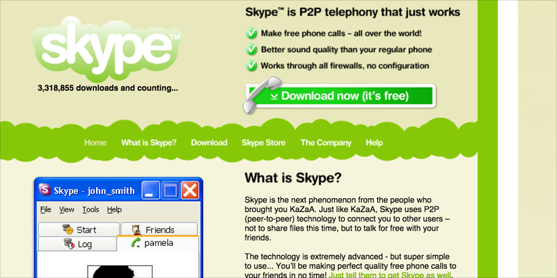
Several years later, they would start to simplify things a bit with a simple call to action and less text. Images, however, were still small and the text was never superimposed, like it is now, on oversized hero images.
Skype Home Page (2009)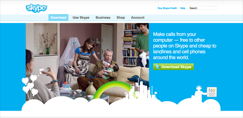
Today, Skype has embraced flat design and full-width images that speak volumes on their own:
Skype Home Page (2016)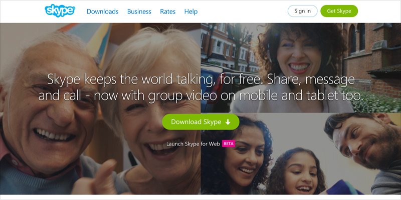
6. Whitehouse.gov
Although this home page might not top your list of favorite sites, it certainly is an important one that gets visits from all over the world. Do you remember back when websites used to have these hideous backgrounds and fonts with poor readability?
White House Home Page (1999)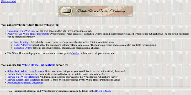
In 2006, things didn’t get much better. Like others on this list, the home page was very text-heavy, with bloated menus and widgets that distracted the viewer from the actual content.
White House Home Page (2006)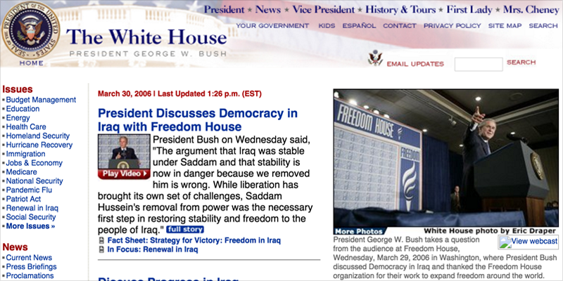
Fast forward to 2016. Although it took about a decade to get things on the right track, here we see a much greater emphasis on the content and less focus on the navigation, which is also much more simplified with hidden menus that appear when you hover over them.
White House Home Page (2016)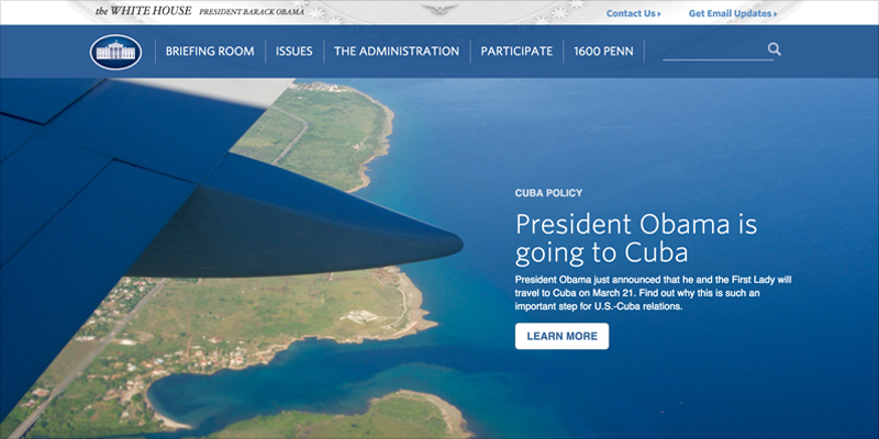
Interested in seeing some more website redesigns? Take a look at some of our past projects, with before-and-after images, and let us know your thoughts in the comments section below.
We hope this inspires you on your quest to building not only one of the most attractive sites on the Web, but also a highly usable one that makes for a pleasant and effortless user experience.

Leave a Reply