Quick question: When was the last time you signed up for a newsletter on a site? And when was the last time you were annoyed by one of those pesky pop-ups?
Chances are you responded “X months ago” to the first question and “yesterday” or “last week” to the second.
While newsletter opt-in forms are not classy (we know!), they do work for many sites, including both B2B and B2C businesses.
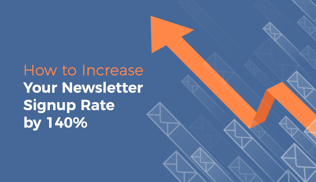
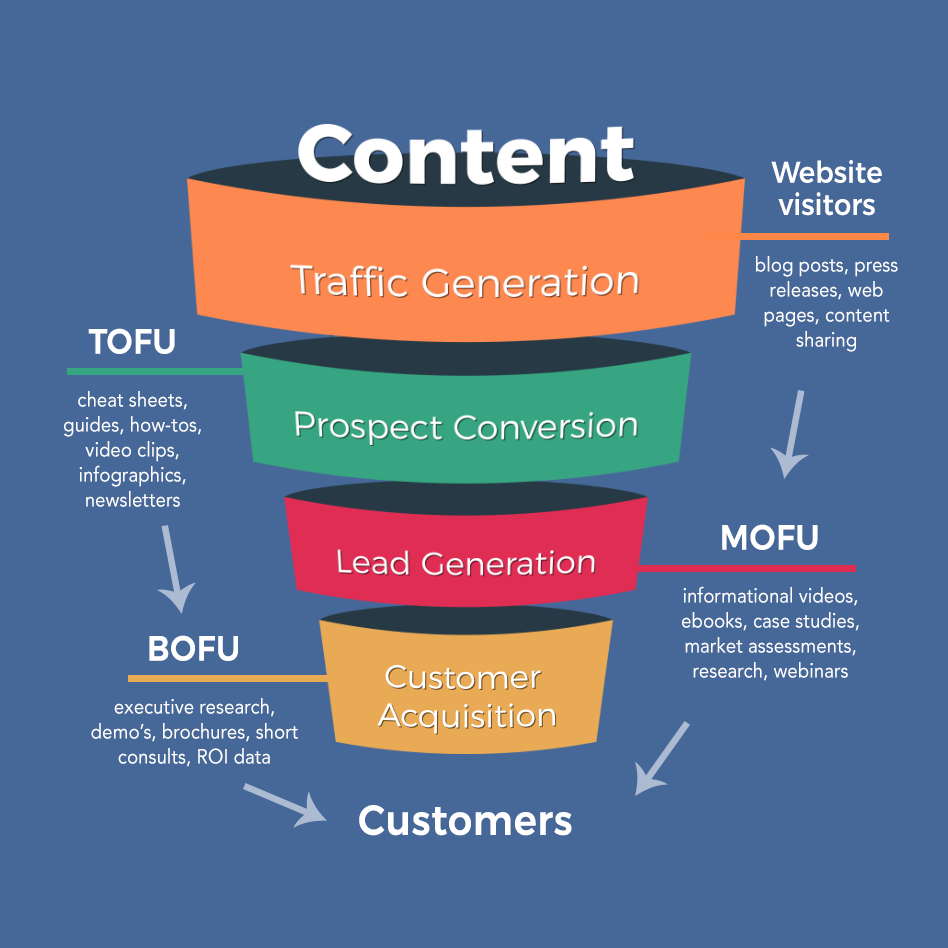
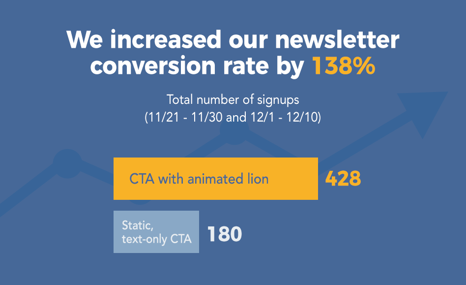
Take, for example, this site we designed which increased its newsletter conversion rate by almost 140% overnight and, as a consequence, increased the number of potential customers who journeyed through the following sales funnel:
Although the average email opt-in rate is 1.95%, which seems low, the top 10% of marketers average a 4.77% opt-in rate. This means that with some carefully thought-out planning and deliberate design decisions, you can double or even triple your conversion rates.
This is why you should seriously think about revisiting your website and optimizing your signup flow to drive audience loyalty and on-site engagement.
Let’s take a look at how we did it for Visme’s blog, step by step:
1. Determine the baseline conversion rate.
First, before taking any action, we analyzed the performance of the old signup form and took a baseline measurement of its conversion rate.
We found that, on average, 20 to 30 visitors were signing up through this relatively small and unobtrusive pop-up that would appear in the lower-right corners of users’ screens, after scrolling down more than 50% of the page’s length.
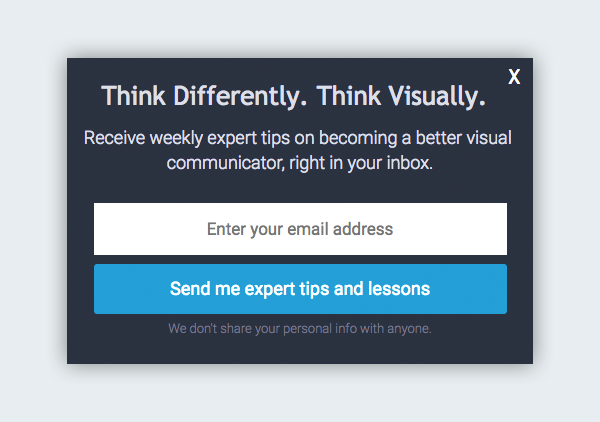
2. Reevaluate message and design.
We quickly came to the conclusion that this boring-looking, no-frills, text-only form did not reflect the unique value proposition of the site: to empower readers to communicate visually.
So we decided to go for a highly visual, animated full-screen pop-up with a unique, eye-catching message.
Although full-screen pop-ups are often seen as the most annoying and intrusive kind of opt-in forms, they are also some of the most effective if done right. In this case, we needed the extra real estate to craft a highly visual message.
Also, with the right amount of wit and originality, a full-screen pop-up may quickly go from a momentary nuisance to a welcome distraction.
3. Brainstorm and mock up a few designs.
We then took some time to brainstorm messages and find high-quality photos, free for commercial use, that could effectively transmit our unique value proposition.
For example, in our case we wanted to get across the message that in this fast-paced digital age, visual content is a more powerful and effective means of communication.
To do this, we decided to aim for an ad-like pop-up that would get visitors to do a double take and one of two things: 1) get them to think; or 2) make them laugh.
So we came up with a few concepts, just to get our creative juices flowing:
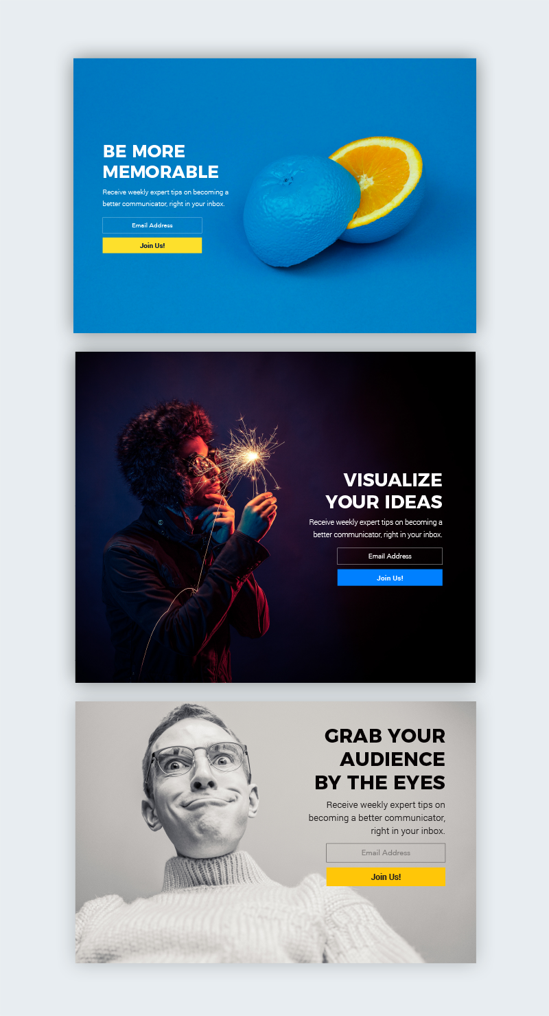
As with all things related to creative tasks, you will probably come up with several ideas that will end up in the wastebasket. But don’t worry; it’s not time lost. It’s just part of the creative process you’ll need to follow to come up with the very best idea for your site.
Although attractive, the first two concepts didn’t really conjure up the right associations in viewers’ minds, so we decided to scrap them. The third wasn’t really in line with the look and feel we were going for: humorous, modern, edgy.
So we went back to the drawing board and after a few more rounds of brainstorming, we finally ended up with these two concepts:


We decided to have each of the elements ease onto the screen using subtle animation effects. More than for show, these are intended to draw viewers’ eyes to the key parts in the message.
Also, notice that each subject’s gaze, in the case of both the lion and the man, is directed toward the call to action and the central message on the right side of the popup.
Finally, we also made sure not to interrupt visitors as they’re reading a post by implementing what’s called an exit-intent form. This way, the pop-up will not appear while they’re scrolling through the page, but only when they are about to leave.
4. Do A/B testing to determine the best option.
The only way to really know what resonates best with your audience is to test it. So we set up a simple A/B test, which entails nothing more than creating two versions of a pop-up and then showing version A to 50% of the readers who visit a page and version B to the other 50%.
After a period of 10 days, we found that the CTA with the animated lion performed 17.5% better than the one with the animated man (which seemed too “creepy” or “weird” to some users).
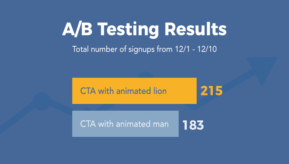
Based on these results, we decided to show all users the animated lion for another 10-day period.
When compared to the number of signups collected with the text-only version, we found that the new CTA performed almost 2.4 times better than the old version:
Quick Tips to Boost Your Conversion Rate
So, yes, conversion optimization tests really do work. Here’s a quick rundown of the most essential points you need to keep in mind next time you want to optimize your pages so they convert better:
1. Offer a clear value proposition.
It almost goes without saying that if your visitors don’t see enough value in your offer, then they won’t sign up. Entice them by communicating as clearly as possible what’s in it for them.
2. Reduce the number of form fields.
In line with the previous advice, make sure to include as few form fields as possible. Online users usually have short attention spans, so make signing up as painless as possible.
3. Feature a prominent call-to-action button.
If you want to make sure your visitors don’t miss out on your offer, then feature a prominent call-to-action button that’s as wide as the form fields above it.
4. Make it simple and limit the number of options.
One essential tip for any piece of communication is to keep it short and simple. The longer your message, the more likely you’ll dilute it and lose visitors along the way.
5. Use action verbs.
It might seem like a simple concept, but visitors won’t do something unless you ask them to, so use action verbs in your conversion optimization techniques to encourage visitors to engage with your site.
6. Provide a pleasant user experience.
At the beginning of this post, we noted that pop-ups are annoying to most users, so you want to integrate CTAs into your site so they blend in seamlessly with the rest of content (and at the same time catch attention), versus interrupting visitors with unwanted messages.
In the example above, the CTA appears when users are about to leave a page, not when they’re in the middle of reading content.
7. Test variations of your design.
As seen in this case study, it’s important to test different variations of your design. Decisions as small as the color of a button or the wording of a message can have a significant impact on the success of your signup form.
8. Use high-quality images and illustrations.
As the test above indicates, design matters—a lot. So take the time to come up with the most professional and eye-catching designs that go along with your brand’s image, values and feel. Always use high-quality images and illustrations that are free for commercial use.
9. Apply design principles to attract viewers’ eyes.
Applying simple design principles can go a long way in leading visitors to take a desired action on your site.
For example, be placing text directly in the line of gaze of the subjects featured in your call to action, you can naturally move viewers’ eyes toward your key message and call-to-action button.
10. Know your audience.
In the example above, we experimented with several variations; some were safe options, others a little bit out of the ordinary.
Before you decide to either play it safe or be a little risqué with your messages, first get to know your audience and what resonates best with them.
11. Include a privacy statement.
Finally, include a privacy statement in your signup form. It doesn’t have to be anything too lengthy; just a line stating that you don’t share subscribers’ personal information with anyone.
Which of these conversion optimization techniques has worked best for your site? Or do you need help implementing a new signup form on your site? Don’t hesitate to contact us for a free initial consult below.
Leave a Reply