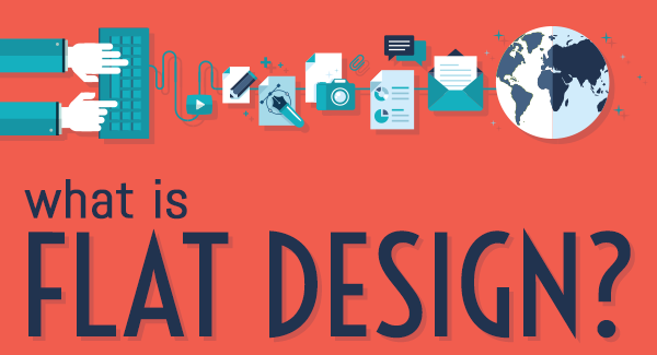
The most widely used term for the current trend in web design is a style called Flat Design. But what is flat design?
Flat design is a minimalistic design approach that emphasizes usability. It features open space, crisp edges, bright colours and two-dimensional/flat illustrations.
In contrast, a few years back the internet was gung-ho on a another style that brought realistic textures, faux 3D shapes, drop shadows and glossy buttons. The style was called skeuomorphic design, and was embraced by many web and application designers. Using familiar real-world objects as inspiration for on-screen icons and interfaces made sense, because users enjoyed interacting with imagery that was relatable to their lives.
Remember, the interface and app icons for the early iPhone. 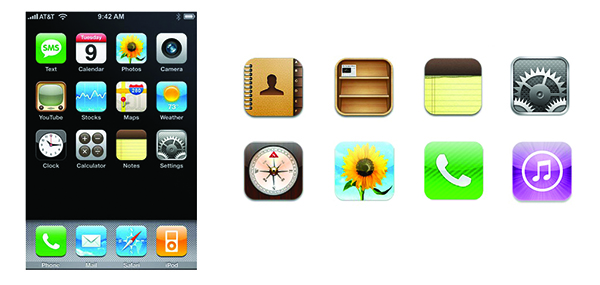
Look at the address book icon, the faux leather and use of layers and shadows give it the look of a real object. Many icons have a nice glossy look to it, giving the impression that there’s a plate of glass overtop of it. The Newsstand icon resembles an actual bookshelf with little book and magazine covers on the shelf.
Microsoft was the first company to present flat design to the mainstream consumer through the Zune interface. Shortly after Zune was outshined by the increased sales of the iPod, Microsoft took what they learned and applied it to the Windows phone.
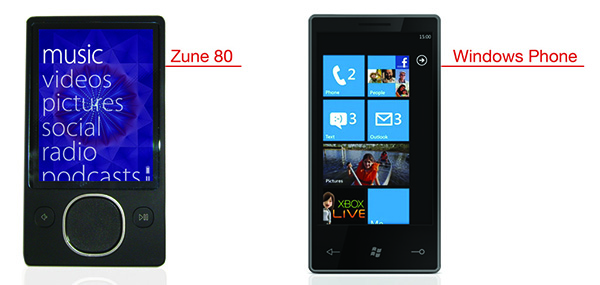 In comparison to the iPhone, Windows has a much sleeker design. A strong grid structure, bright engaging colors and simple icons that animated when selected. These elements excite the user and encourage usage and play.
Designers have since taken the flat design aesthetic from applications and implemented it into web design practices.

What caused the change in trends?
Many designers and developers were skeptical of the skeuomorphism style as a necessity in the digital space. As the digital space is separate from reality, the interface should be separated as well. It should function as a conduit to complete tasks and solve user problems, not resemble life-like objects that have no purpose in a two-dimensional space. Thus, the focus of flat design is user experience. By removing the complexity of textures, shadows and realism, the user has an easier time deciding where and how to complete a given task.
Taking a cue from Windows, Apple made the switch to flat design in iOS7, and consumers rejoiced!

Can you tell which version is flat and which is not? (Hint: It’s the one on the right)
Notice how the flat version looks more illustrated than actual objects. Take the ‘Camera’ icon as an example, the skeuomorphic icon resembles an actual camera lens and the flat version is a depiction of an entire two-dimensional camera. The ‘Newsstand’ icon has been designed to look like a physical bookshelf, but the flat version shows illustrated magazine covers. Finally the ‘App Store’ icon, observe how the icon is almost the same, yet in the flat version, the starburst background, glossy effect, and drop shadow has been removed. The symbol itself is now the main focus of the icon to maximize app recognition.
Should flat design be implemented on your site?
The short answer is, maybe. Every company is different. It may make sense for one company to embrace flat design, while another continues with realism. If the purpose of your site is to increase conversion rates and raise then it is strongly recommended that you consider a flat design solution. The common rationale against flat design is nothing on the site stands-out, no pizazz, no flash. This has been proven untrue through several usability tests. By using basic design principles and color theory, content and navigation can be structured to have a positive impact on engagement. An example of such a difference in visual presence: 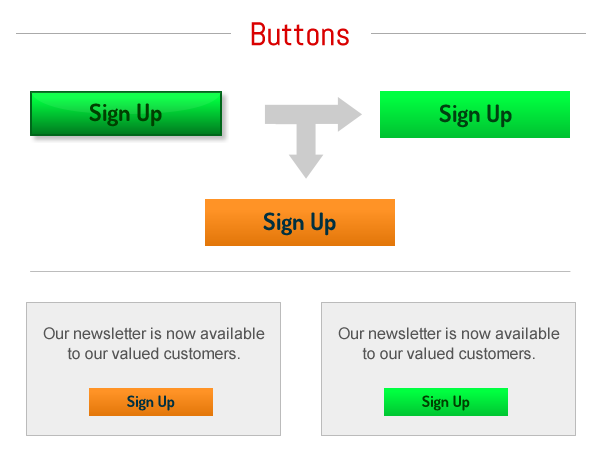 The button above does not require a drop shadow, outside stroke or glossy effect to be effective in conversions. Striping away all the unnecessary design from the button, allows the user to quickly access whether or not the button is useful to him. It may also be more beneficial to do a simple color change. As shown above, the orange button is more appealing than the green version, thus increasing the click-through rate. Since flat design aides the user to complete various tasks faster, the process at which turnover occurs will also hasten. Properly implemented, flat design will work as a tool to increase customer/prospective engagement, conversion rates and visual appeal on your website. Not only will your customers thank you for making their task-completion process easier, but so will your bottom-line.
Leave a Reply